48

I found this searching for information on how to program for the old Commodore Amiga’s HAM (Hold And Modify) video mode and you gotta touch and feel this one to sneer at it, cause I haven’t seen a website this aggressively shitty since Flash died. the content isn’t even worth quoting as it’s just LLM-generated bullshit meant to SEO this shit site into the top result for an existing term (which worked), but just clicking around and scrolling on this site will expose you to an incredible density of laggy, broken full screen animations that take way too long to complete and block reading content until they’re done, alongside a long list of other good design sense violations (find your favorites!)

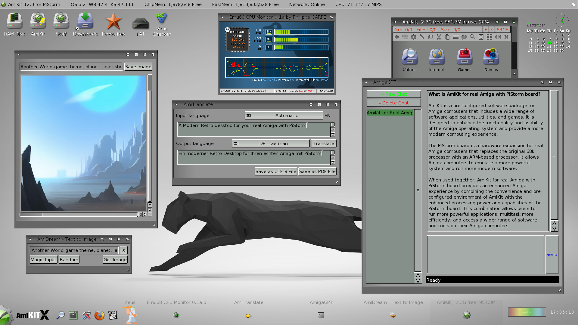
bonus sneer arguably I’m finally taking up Amiga programming as an escape from all this AI bullshit. well fuck me I guess cause here’s one of the vultures in the retrocomputing space selling an enshittified (and very ugly) version of AmigaOS with a ChatGPT app and an AI art generator, cause not even operating on a 30 year old computer will spare me this bullshit:

like fuck man, all I want to do is trick a video chipset from 1985 into making pretty colors. am I seriously gonna have to barge screaming into another German demoscene IRC channel?

top 31 comments
sorted by: hot top controversial new old
[-] fasterandworse@awful.systems 16 points 1 year ago

Here's some meandering thinking on this...

I use an iOS app called Toot! and it does something special that helped me realise a distinction from sites like this.

The Toot app has all this weird stuff in there, none of which gets in the way, none of which serves any purpose, it's just weird. For example if you click on the action menu in a user profile it has an option "scan user" which plays a cheesy robot-view style scan animation over the page. Or if you unfollow someone, their avatar animates out of the bottom of the screen like a ghostly soul leaving the body.

Anyway, in UX design there is always talk about things like "micro animations" like elastic movement of scrollable items, subtle parallaxing, etc incorporated into the ui interactions. They talk about "conversational ui" where all of the text is conversational - "oh no, there are no results for your search!..." kinda bullshit. The idea being that you are brightening up a user's day, bringing delight, and all that shit. This all ignores the hard truth that craigslist still works fine. But that's beside the point.

The distinction, I think, between these two things is warmth and coldness. Toot! is a capable but otherwise standard masto client, it's actually a bit confusing to navigate in some places - but it's got that thing where you can tell it's a small team who have fun making it - the effect is a bit like contagious laughter. On the other hand you have the UX designed, orderly implementations of fun that don't give you any indication that the thing was made by people. That's where the coldness comes from and I don't think that even registers as a factor among the people who talk about "human-centeredness" in design. Not just that you're designing for people, because why the fuck do you need to be reminded of that, but that the person(s) making something should leave some imprint of their work in that thing.


This is similar in philosophy to the physical products that show signs of use over time. Instead of putting the imprint of the makers in the mass-produced thing, they let the thing collect the imprints of the owner/user so they see themselves in it. Like early macbook pros with thin aluminium shells rather than the modern solid unibody, they collected dents over time.

I don't buy into the trope of IKEA furniture having this effect because you "build it yourself" btw. That's marketing bullshit that ignores the fact that IKEA sells because it's cheap as fuck and you can furnish a room with one trip in your hatchback. Big item garbage pick-up days should be called IKEA garbage pick-up day.

so yeah. This site is an example of coldness via simulated warmth.
[-] froztbyte@awful.systems 8 points 1 year ago

the phrase "corporate mandated fun" popped into my head as I watched this site, and I think it ties in with what you said here

[-] self@awful.systems 8 points 1 year ago

these are very good points

for some reason I can’t stop thinking about a web app I use daily that randomly plays a confetti animation when I interact normally with it, then pops a notification that reads “you just saw an animation! we’ll play these from time to time.” and it displays that notification every time there’s an animation with no way to turn either one off, and I can’t remember why but either the animation or the notification is implemented so poorly it actively interferes with my workflow for a few seconds

[-] fasterandworse@awful.systems 5 points 1 year ago

re-reading this after coffee - need to avoid writing opinions so early in the morning

[-] swlabr@awful.systems 8 points 1 year ago

A few select snarks:

  • I like the part where my cursor is replaced by a blue circle painted onto the background so that when I scroll upwards, it looks like it is moving when it isn't. It's a lot of fun, if not completely nonsensical.
  • The whole page shifts horizontally when you click the hamburger menu and shifts back when you exit the menu
  • Speaking of which, why does this page need a menu? And why does it have to be animated? Why does the cursor indicate that most of the area in the menu is clickable when it isn't? And why is the button to exit the menu in a different place to the hamburger?
  • No animation for transforming the blue circle to the big circles with arrows. If you're going to animate everything, why stop here?
[-] self@awful.systems 8 points 1 year ago

check out their main page, cause it gets so much worse

also did you notice that on load every page does a fake loading-style animation regardless of whether or not everything is already in cache? they somehow ported Flash’s loading jank into CSS and I fucking love it. this is the kind of talent we need to reskin awful.systems

[-] fasterandworse@awful.systems 7 points 1 year ago

did you see the home page? It loads a splash animation of their shitty logo before revealing the content. Immersive!

[-] fasterandworse@awful.systems 7 points 1 year ago

I only just noticed this is the website for a digital agency. It makes a bit more sense in that context. It's not right, but it's the kind of stuff that suits sell to suits who think people love their product so much that they want a scrollytelling* experience to learn more about it

*I learned this word last week and I love it so much - chef's kiss coporate marketing delusion

[-] Soyweiser@awful.systems 6 points 1 year ago

I remember when the 2000's pages did this, and all in flash. There used to be an HR Giger inspired one where the inferface also made noises. "Time to click a link" Link squelches

[-] fasterandworse@awful.systems 5 points 1 year ago

If there ever was a purpose for Flash on the web...

[-] fasterandworse@awful.systems 3 points 1 year ago

p.s. your "Link squelches" makes me want to watch eXistenZ

[-] fasterandworse@awful.systems 7 points 1 year ago

the shift from the hamburger menu is because the scrollbar disappears. They could easily fix this by making the :root {width: 100dvw} which makes it 100% dynamic width - meaning it ignores browser elements like scrollbars.

but the site is drupal so there's a good chance this is a modified theme

[-] swlabr@awful.systems 6 points 1 year ago

I don’t want it fixed. It’s perfect as is

[-] MrJameGumb@lemmy.world 8 points 1 year ago

I know almost nothing about web design, but I feel confident in saying whomever put that bouncing menu button on the side should be fired

[-] self@awful.systems 7 points 1 year ago

you know more about web design than these web designers

[-] gerikson@awful.systems 7 points 1 year ago

It's a UK company, so it looks as if the cast from "Attachments" has returned to the biz after a whole lotta E.

https://en.wikipedia.org/wiki/Attachments_(TV_series)

[-] fasterandworse@awful.systems 4 points 1 year ago
[-] gerikson@awful.systems 5 points 1 year ago* (last edited 1 year ago)

You really don't.

http://www.ntk.net/attachments/

Edit that just seems to be standard early 2000s NTK branded snark, not so much Attachments.

God, I miss NTK.

[-] fasterandworse@awful.systems 4 points 1 year ago

Oh I have to watch it now. A terrible early-2000s era British theatrical interpretation of a startup in the dot com boom? Apparently criticised for excessive sexual content!

[-] maol@awful.systems 6 points 1 year ago

This is the poor man's World's Worst Website Ever.

[-] getynge@lemmy.world 4 points 1 year ago

Oh my word I need to check this out on my desktop tomorrow, it's already so bad on mobile it's like somebody managed to modernize every bad 90s web fad.

[-] self@awful.systems 6 points 1 year ago

the experience between mobile and desktop was remarkably consistent for me. somehow the bad ideas port over perfectly, they’re just larger

[-] Soyweiser@awful.systems 6 points 1 year ago* (last edited 1 year ago)

On desktop you do see the weird mouse effects. Which remind me of the sticky keys windows thing.

The site is also written by AI I think (the 8 vital strategies for online security has several tips which have little to do with online security ('have secure backups!' it is also the blandest of bland content).

[-] jonhendry@iosdev.space 3 points 1 year ago

@self

I’ve never witnessed such passion for the Web Designer’s Art.

[-] saucerwizard@awful.systems 3 points 1 year ago

Whats the appeal of Amigas? I really regret being too young to appreciate things like it and BeOS.

[-] self@awful.systems 8 points 1 year ago

it definitely varies based on the person but roughly:

  • it’s hardware and software you can fuck with. the schematic of an Amiga is so simple that it can fit in your head, but its custom video chips are so flexible that folks are still finding new techniques to get beautiful results out of them (I’ll come back to this post when I have time and link something relatively recent from the Amiga demoscene that shows this). in short, it’s a system designed from the ground up to render beautiful graphics on an old school CRT
  • likewise, the OS is extremely modular and easy to modify, though it’s not open source (it really should be — the vultures in the retro space you’ve heard me complain about ensure it isn’t). all of the data structures and APIs the OS exposes are very visible due to its architecture and lack of memory protection. not having memory protection sounds shitty, but the Amiga does its best to turn that into a strength; there’s a bunch of support in the OS for fucking around, finding out, and recovering afterwards, and there’s also a wonderful feature parity between the Amiga’s GUI, CLI (AmigaDOS, a mix of someone’s memories of Unix and CP/M that’s actually surprisingly pleasant to use), and scripting languages
  • the platform has a lot of support for banging on the hardware directly without the OS running if you want maximum efficiency, and there’s even a modern framework (WHDLoad) that’ll paravirtualize your OS so you can run a game that takes over the hardware then exit back to your running OS afterwards
  • it’s a very easy retro platform to modernize. my Amiga has an inexpensive accelerator card that uses a Raspberry Pi to emulate an impossibly fast 68k CPU, hard drives, 720p graphics card (which the OS uses, but games still use the authentic graphics hardware), networking, and a shitload (128MB) of RAM. it turns out you can do even more tricks on the 1985 graphics hardware in the Amiga if you give it an impossibly fast CPU and hard drive and a shitload of RAM
  • it’s a good gaming platform, though try it in an emulator if you only want that
  • “nostalgia!” is the common reason you hear from the shitheads in the retro scene trying to charge you way too much for old hardware. I didn’t grow up with these computers so that’s bullshit, I just think they’re cool as fuck
  • new shit is still coming out for this platform? other than 68k accelerator tech only getting better (now that PowerPC is finally dead), AmigaOS 3.2.2 only came out this year and has a bunch of improvements. it’s the sequel to AmigaOS 3.9 and AmigaOS 4 (yes there’s a story behind this)

this concludes the prepared Amiga rant you have fallen victim to

[-] self@awful.systems 4 points 1 year ago

youtube must’ve heard me cause this compilation of Amiga demos from the Revision 2023 demoparty a few months ago was in my recommendations (flashing lights warning for those unfamiliar — this is basically the live visuals and music for a very nerdy type of rave). I timed it to skip the first demo, Blood Sugar Rising, cause I felt like it wasn’t as impressive as the rest. note the lower right corner of the screen when each demo starts — OCS demos run on the Amiga’s original 1985 chipset, and AGA demos target the 1992 revision of that hardware. traditionally, demos usually target unaccelerated Amigas, so they’ll usually run on machines with ordinary CPUs and mild RAM upgrades

when you watch these, note how many impossible things seem to be happening: none of these effects are built into the Amiga, it definitely shouldn’t be able to support complex 3D, and it should have a very constrained color palette to work with; these and many other visual effects in these demos are enabled by tricks the demoscene has mastered. even the audio shouldn’t be possible — the amiga’s audio hardware was considered to be too primitive to play back samples at high fidelity or handle complex effects

a lot of the tricks the demoscene discovered have made their way back into Amiga development — there are now AmigaOS apps that use the 1985 chipset to do previously impossible things like better-than-VHS video playback and MP3 playback while multitasking

[-] froztbyte@awful.systems 3 points 1 year ago* (last edited 1 year ago)

I was just opening pouet to pull up this year's revision entries

if you look at the specs of it, it's absolutely astounding what sceners produce on the amiga

edit: this made me think of something, so I posted about it

[-] self@awful.systems 2 points 1 year ago

fuck yeah! an OCS Amiga runs on a ~7MHz 68k CPU (the basic one with no cache or FPU), usually 512k of RAM (modern demos and games often grab a luxurious full 1MB cause a lot of Amigas had that RAM upgrade back then) and a single 880k floppy drive with no other permanent storage. but all the rest of the chips in the system run as concurrently as possible, in a way that feels like having a primitive GPU but with a lot more control over what its individual components do

[-] HerbalGamer@lemm.ee 2 points 1 year ago

ok so it's bad but hear me out...

have you ever heard of a little internet gem called youareanidiot.com?

[-] HerbalGamer@lemm.ee 2 points 1 year ago

I know this link doesn't work anymore but please tell me someone remembers this

this post was submitted on 21 Sep 2023
48 points (100.0% liked)

TechTakes

1563 readers
141 users here now

Big brain tech dude got yet another clueless take over at HackerNews etc? Here's the place to vent. Orange site, VC foolishness, all welcome.

This is not debate club. Unless it’s amusing debate.

For actually-good tech, you want our NotAwfulTech community

founded 2 years ago
MODERATORS