112
Why is #FFFFFF white, but mixing red green and blue paint is black?
(sh.itjust.works)
I think the simplest way to explain it is:
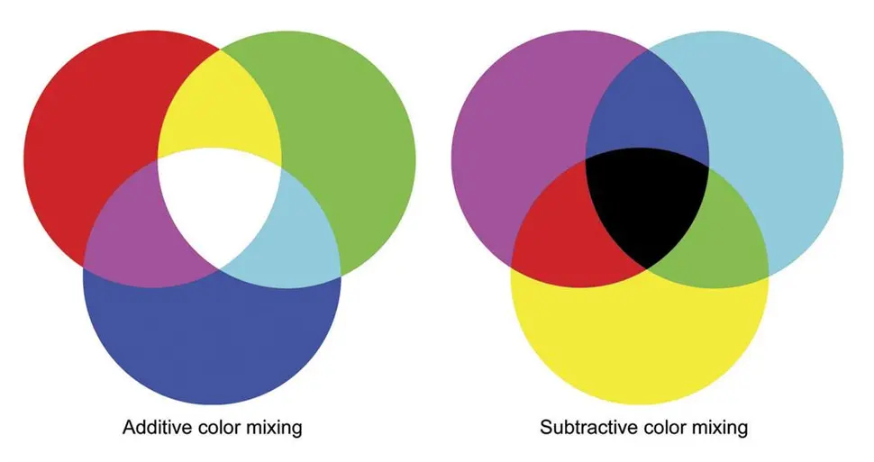
RGB are the base colors for addative methods like light mixing. Think about pixels on a screen.
CMY are the base colors for subtractive methods like paint mixing. Think about printer ink.
paint and light are different. for light, you are adding colours onto black to make it brighter; for paint, you are subtracting colours from white to make it darker. thus, respectively, additive and subtractive colours.
red, yellow, and blue being "primary colours" is there because people probably think "magenta" and "cyan" are too complex of concepts to teach young kids. it is cool to have a way to make orange and purple without delving into paint ratios, though. it's good enough for general use for sure, but if you want to get into colour accuracy for print, CMY is the way to go.
here's a quick and simple cheat sheet to help you out!
additive colours (RGB; screen pixels, LEDs):
subtractive colours (CMY(K); paint, prints, colouring pencils):
There is a difference between colors you see from reflections, and from a direct source.
Your t-shirts is light hitting them, and reflecting back to your eye. Depending on what is reflected and what is absorbed, you will get a colour.
But that will not be the case from screens that emit their own light.
It is the difference between additive mixing and subtractive mixing. When you mix colors on a screen with RGB, you add light. When you mix pigments on a physical medium, you subtract the amount of light reflected (because each paint absorbs most light except the colors it reflects, which are what you see).
As a side note, when mixing in the subtractive color system, your primary colors are cyan, magenta, and yellow. That's why a printer takes CMYK, for cyan, magenta, yellow, and black. In case you were wondering, 'K' here is black.
K is key. It's not necessarily black ink, but tends to be when printing on white stock.
If you're printing on black stock, for instance, you'll likely have white ink for the key.
Thank you for the correction.
Great explanation. Thank you.
Can you also tell me how a computer monitor makes Yellow when it only has RGB pixels?
Sure! On a spectrum of visible light, yellow has a wavelength between red and green. Therefore, combining red and green, the average wavelength is the same as the wavelength of yellow. In fact, a yellow pixel is really just a pair of red and green pixels on most monitors (except with certain types of expensive monitors in which each pixel has red, green, and blue instead of red, green, or blue).
For reference:

I hope this helps.
That makes sense. Thank you. I think the rules between additive and subtractive mixed together in my head and confused me.
One curious thing if you understand this is to think on purple. Purple is blue+red, but like you pointed out 2 colors should give you the average wavelength, which in the case of blue+,red should be green. So why the hell do we see purple as something different? Well, that's because humans have 3 sensors for colors, roughly corresponding to Red, Green and Blue, triggering both Blue and Red without triggering green at the same time gets interpreted differently than green, even though it shouldn't. Which means that purple is not a color, but rather a mind trick your brain plays on you.
Yes, but violet light does exist in nature as higher frequency light than blue light. Violet is only a mental oddity when mixing additive primaries.
I've been wondering - how do you make brown? Don't really see it on the spectrum.
Dark orange, it's only brown when contrasted with something brighter.
There is a technology connection video that goes into more details.
About 2 parts red to one part green.
red light + green light = yellow light
Basically yes, look up additive vs subtractive colors... that's why for a monitor you need RGB, but ink cartrages are Cyan Magenta and Yellow
https://cdn.mos.cms.futurecdn.net/6FSgP38XcxfqQuiYicQx5Z-970-75.jpg.webp
In short, colored light, and pigments work in opposite ways. Basically all visible light mixes together to make white light. Blue paint, basically absorbs the red and green light, allowing only the blue to bounce back... so mixing more colors of paint, means less light. until almost nothing gets out (hence black). But on a light source, more colors = more light, leading towards white.
Colours are wavelengths of light.
Shining light directly combines wavelengths. It is additive.
Colored paint absorbs the wavelength and reflect only part of it. It is subtractive.
When you mix paint, you mix pigments that each absorb certain colors, so they won't reflect it. You're subtracting colors to the ambient white light that reflects a smaller and smaller portion of the spectrum on the painted surface, and if you mix enough colors you substract most of it and get a dark brown or even black. When you encode rgb values for a screen, you tell pixels to add colors to the light your screen is generating, and if you add enough you get a white light.
Paints absorb light really Red paint should be -#00FFFF so under white light the light becomes FFFFFF-00FFFF -> FF0000
Of course under blue light (0000FF) it becomes 000000
If you mix paints you end up with -FFFFFF which turns any light into 000000.
Basically consider paint a transformation when it comes to light rather than a source
Subtractive colors like paint create color by selectively removing some colors from existing light.
Additive colors like backlit or light-emitting displays create color by creating colors of light in various proportions that are then combined.
If you are in a dark room, all paint is black. Until you turn on something with RGB, because then you have some light for it to selectively absorb. However if your RGB is only displaying green light, and you shine it on red paint, it will look exactly the same as black paint (within a certain ballpark of imperfect materials, anyway). Green paint will look green, or white, depending on how your eye adapts, and green and white will be indistinguishable.
That's the difference between the two color models. Does it rely on other light sources (subtractive), or is it a light source (additive)?
How the brain actually perceives color is really, really wild, so this is all a bit... fluid when you start getting into the weird edge cases, but the general principles of additive=light emitting and subtractive=light absorbing are generally applicable.
Thanks for asking this. I've always known light and paint worked on different color systems, but I never really understood the why behind it. Great answers!
As someone who's mostly been in the digital domain since childhood and had to learn early on about the difference, it's one color system, it's just that they're doing different jobs.
Other comments are discussing additive vs subtractive colors, but that’s not accurate if you’re talking about mixing paints. Subtractive printing (CMYK) works by overprinting transparent inks, where each ink removes a different part of the spectrum. But mixed paints differ in two critical ways:
A good way to get experience with the subtractive system would be to use watercolors, markers, or dip pens with ink, since those are transparent.
You are right that paint is kind of its own thing and doesn't really fit into the RGB or CMYK systems
But I would say it's overall still subtractive. The paint and whatever you're painting on isn't giving off any light on its own, its just reflecting whatever ambient light there is (which is usually more or less white) and subtracting from that.
You could maybe argue that it's more replacive (is that a word?) than additive or subtractive. It just kind of is what it is. It's just replacing the substrate's reflectivity with its own since it's opaque like you said.
And when you mix paints it tends more towards that grey-brown because like you said it's not layered, it's more that each pigment is right there on the surface next to each other reflecting and absorbing their part of white light.
So if you mixed cyan and magenta paints together, instead of light passing through layers of cyan and magenta until all the red and green are filtered out so that only blue light reaches the white paper and is bounced back to your eye, you'd have cyan piments reflecting blue and green, mixed in right next to magenta pigments reflecting red and blue. So both are reflecting blue and the resulting color will probably look blue-ish, but the cyan is reflecting some green, and the magenta some red, so that pulls the color more towards grey (somewhere between white and black, even if you mix all 3 it cant really get down to true black or true white because some light is always going to be absorbed and some reflected)
I’m not sure I’m accurately visualizing exactly what you’re describing, but I know from experience working with a two-color offset press that the results are quite different if you print two colors in two passes vs one pass (in which the inks are combined on a “blanket” where they effectively mix together before being transferred to the paper all at once).
In the first case, the result is exactly what you’d expect from a subtractive color model; but in the latter case, the mixed ink that ends up on the paper is no darker than the component inks. The hue is similar whether overprinted or mixed, but the saturation is reduced in the mixed example.
Yeah that's basically what I'm describing.
I think you just have more of a precise, technical way of describing it probably because you've actually professionally worked with color and received some formal training
Whereas I'm a guy with some self-taught Photoshop skills who paints minis, so my color theory is a little rough and ready.
The colors on a monitor are defined by what wavelength they emit. The colors of paints are defined by what wavelength they fail to absorb. When you mix colors on a monitor, you add more wavelengths that are emitted. When you mix paints, you add more wavelengths hat are absorbed, meaning fewer are reflected for you to see.
One adds colours the other subtracts them.
Like others have said, it's about additive vs subtractive color
And to start off with, probably everything you know about color is probably over simplified, or even outright wrong. Light and color and how your brain interprets that information is pretty complex stuff. Even this explanation is gonna be glossing over things.
Starting from the basics, white light contains all of the colors of the rainbow.
Your eyes, however, are mostly only sensitive to red, green, and blue light, most people only have receptors in their eyes (cones) for those 3 colors. They do pick up a little bit from the surrounding parts of the spectrum but not much, and your brain sort of fills in the gaps from there. If your red cones and green cones are both getting stimulated by light, your brain will interpret that as yellow or orange depending on just how much each is picking up.
So your monitor is starting with no light across all 3 colors (black)
And then adding light to get the desired colors.
But if you're drawing or painting, ou're starting with a white canvas, not a black monitor, so how do we go about getting the colors we want!
Well we're going to put paint or ink on the canvas to absorb the colors we don't want.
Back in elementary school art class you probably learned about complementary or opposite colors. Unfortunately the colors you learned were kind of wrong. Close enough for kids mixing finger paints, but not exactly.
The opposite of red isn't green it's cyan.
The opposite of green isn't red, its magenta
But the opposite of blue is in fact yellow, so one out of three is something I guess.
What does that actually mean though? Well yellow ink absorbs basically all of the blue light while still reflecting red and green.
Cyan absorbs all the red light, while still reflecting blue and green
And magenta absorbs all the green light while still reflecting red and blue
So by mixing and matching those 3 colors, you can dial things down from 100% white light to a mix of red green and blue that your brain can interpret as other colors.
In theory mixing a bunch of those 3 colors together, you can eventually get down to black, in practice your pigments aren't perfect, and even if they were it would get expensive to use that much of those 3 pigments which is why most color printers are CMYK, with "K" standing for black for reasons I've never bothered to look up and I'm not gonna start now.
So your monitoring is adding light from 0 up to make the color you need. It's "additive."
And paint is dialing things down from 100 to the desired color. It's "subtractive."
Hopefully that all makes sense, color is weird.
Put another way, let's say white is 100% of each red, blue and green light, and black is 0% of each. Every other color is made up of different percentages of those three.
Your monitor is counting up from zero, you just need to add the colors you want.
On a white canvas you need to subtract from 100.
Cyan is basically negative red, magenta is negative green, and yellow is negative blue.
In theory mixing a bunch of those 3 colors together, you can eventually get down to black, in practice your pigments aren’t perfect
This is a common misconception, but it has nothing to do with imperfections in the pigments. The real issue is that you don’t want each of your primaries to block a full third of the visible spectrum—you want each to block a narrow band of frequencies that overlaps as little as possible with the sensitivity curves of the other cone cells in your eyes, in order to produce fully-saturated colors. The tradeoff is that intermediate frequencies aren’t blocked by any of the primaries, which is why we need to add black.
You are right, but I felt like that kind of gets a little too far out of an easy-to-explain model, and decided to kind of push that off into the stuff I said I was going to gloss over because colors are weird
I suppose it's sort of more like the pigments are intentionally imperfect to compensate for the also imperfect way that our eyes pick up colors that aren't exactly red/green/blue
EDIT: Or perhaps from a certain point of view the pigments are more perfect than our eyes are. The point is the whole system is pretty wonky, a bunch of happy evolutionary accidents happened that allowed our ancestors to be better able to tell what fruit was ripe and spot predators, and at some point we also invented art, computers, monitors, and inkjet printers, and all we have to look at them with are some squishy orbs in our skull meant to spot berries and lions.
I think hsl is the better computer color model
If you're going this route, I highly recommend looking into and using OKLAB instead.
The problem with HSL/HSV is that it's not perceptually uniform - if you only move HUE to change color, you will get different perceived brightnesses. This is important especially when procedurally generating color palettes, but also makes it harder to pick a color.
OKLAB solves that issue, and is designed to be uniform. Here is a great article about it, which is funnily enough IIRC a blog post that invented the color spectrum, that got noticed and eventually turned into a new industry standard.
Here is a picture that sums up pretty obviously what is the difference. This is a gradient that moves just the hue.

I think the difference is one is mixing light and one is mixing colour
I think this is not helpful, since both are "mixing colour". I think a more apt analogy would be "shining multiple lights" vs "stacking colour filters".
!nostupidquestions is a community dedicated to being helpful and answering each others' questions on various topics.
The rules for posting and commenting, besides the rules defined here for lemmy.world, are as follows:
Rule 1- All posts must be legitimate questions. All post titles must include a question.
All posts must be legitimate questions, and all post titles must include a question. Questions that are joke or trolling questions, memes, song lyrics as title, etc. are not allowed here. See Rule 6 for all exceptions.
Rule 2- Your question subject cannot be illegal or NSFW material.
Your question subject cannot be illegal or NSFW material. You will be warned first, banned second.
Rule 3- Do not seek mental, medical and professional help here.
Do not seek mental, medical and professional help here. Breaking this rule will not get you or your post removed, but it will put you at risk, and possibly in danger.
Rule 4- No self promotion or upvote-farming of any kind.
That's it.
Rule 5- No baiting or sealioning or promoting an agenda.
Questions which, instead of being of an innocuous nature, are specifically intended (based on reports and in the opinion of our crack moderation team) to bait users into ideological wars on charged political topics will be removed and the authors warned - or banned - depending on severity.
Rule 6- Regarding META posts and joke questions.
Provided it is about the community itself, you may post non-question posts using the [META] tag on your post title.
On fridays, you are allowed to post meme and troll questions, on the condition that it's in text format only, and conforms with our other rules. These posts MUST include the [NSQ Friday] tag in their title.
If you post a serious question on friday and are looking only for legitimate answers, then please include the [Serious] tag on your post. Irrelevant replies will then be removed by moderators.
Rule 7- You can't intentionally annoy, mock, or harass other members.
If you intentionally annoy, mock, harass, or discriminate against any individual member, you will be removed.
Likewise, if you are a member, sympathiser or a resemblant of a movement that is known to largely hate, mock, discriminate against, and/or want to take lives of a group of people, and you were provably vocal about your hate, then you will be banned on sight.
Rule 8- All comments should try to stay relevant to their parent content.
Rule 9- Reposts from other platforms are not allowed.
Let everyone have their own content.
Rule 10- Majority of bots aren't allowed to participate here. This includes using AI responses and summaries.
Our breathtaking icon was bestowed upon us by @Cevilia!
The greatest banner of all time: by @TheOneWithTheHair!