336
Associated article: https://proton.me/blog/big-tech-pays-fines-under-3-weeks
Associated article: https://proton.me/blog/big-tech-pays-fines-under-3-weeks
Should be the other way around. It takes one year of profits to pay three week worth of fines.
Do they even actually pay these fines tho? I would assume there are just endless legal battles about them and none of them have actually ever been payed.
It would be more illustrative to know the percentage of the annual profits the fine costed them
3 weeks is about 5% of the year. Do you think that’s a more illustrative figure than 3 weeks in a year? I think you’re in the minority on that opinion.
I would be more intrested in how long it takes them to pay a fine using the revenue from the region that fine was issued from.
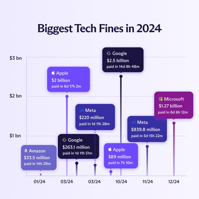
I probably haven't had enough coffee yet, but what exactly is this chart trying to show? And why are MS, Meta, and Apple listed multiple times as opposed to once like they are in the article (once per section)?
It's an incredibly bad chart mostly for the x-axis being so horrible in scale that March, when a lot of fines were handed out, had to be repeated twice.
What we are seeing are specific fines that were handed out. Like the Apple $2B fine is from the EU for antitrust law violation that was handed to them in March. The $89M fine was handed out by the US Consumer Financial Protection Bureau (CFPB) in October over the whole Apple Card thing and how bank disputes weren't being handled and how Goldman Sachs who backed the card wasn't keeping all of the required compliance information (which I'm shocked at how quickly everyone forgot about it).
I digress.
Yeah, this chart is incredibly bad at indicating this information and by breaking out by violation over time really takes away from the point that ought to be expressed.
Yup, the x axis might as well not exist
A date on each bubble might have been better
The article aggregated all the fines per company (though a breakdown is available at the bottom of the article). The image shows the top 8 biggest individual fines, and the companies you listed had multiple fines in the top 8.
It shows the biggest fines imposed to each company and the month they were paid in. At the end of the article there's a list with different individual fines of each company, with the ammount fined as well as the reason and a link to a relevant article. They just took the biggest numbers for this chart. Hope this helps, and correct me if I'm wrong :)
if we could get that to months and for all corps and it would be a decent tax rate.
Yes, but have you thought about the poor CEO's? These fines make it harder for Bezos to buy another yacht to take him to his yacht that tenders his main yacht.
These fines make it harder for Bezos
Truth is he doesn't even notice it. These fines are mere days, maybe a week's worth of income to people like him.
Furthermore, the wealthy don't take cash profits to buy things, they collateralize their wealth for loans to buy yachts.
Be respectful