Meta thread: reply to this comment to discuss the contest. Post only submissions as top-level comments.
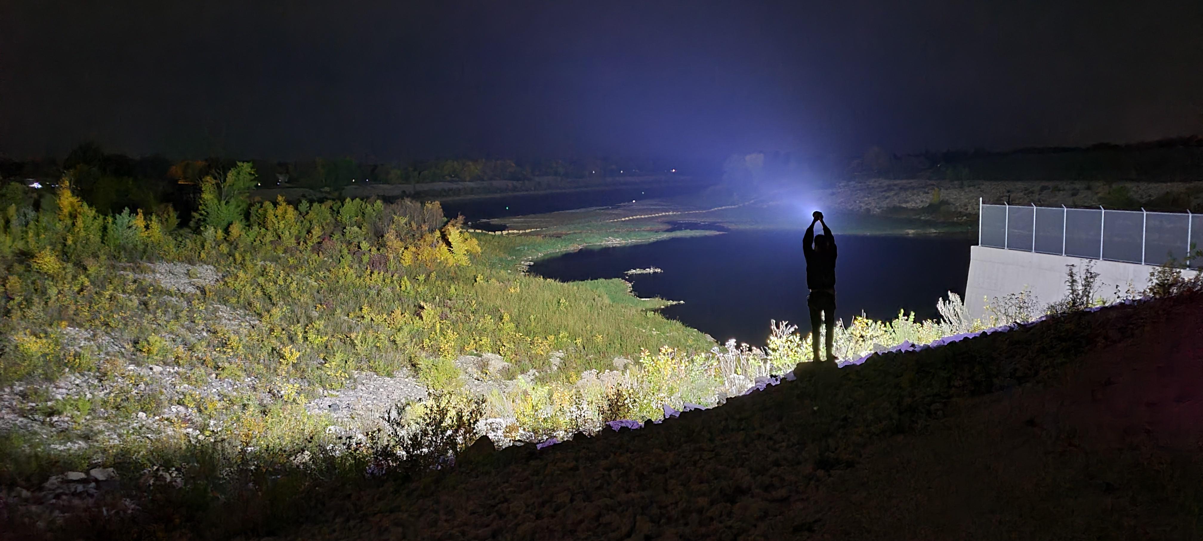
I actually pretty much liked the banner we had at Reddit, the one with the dragons or whatnot being zapped with light beams from the guy on the ground... not sure it fits well here with the cropping etc.
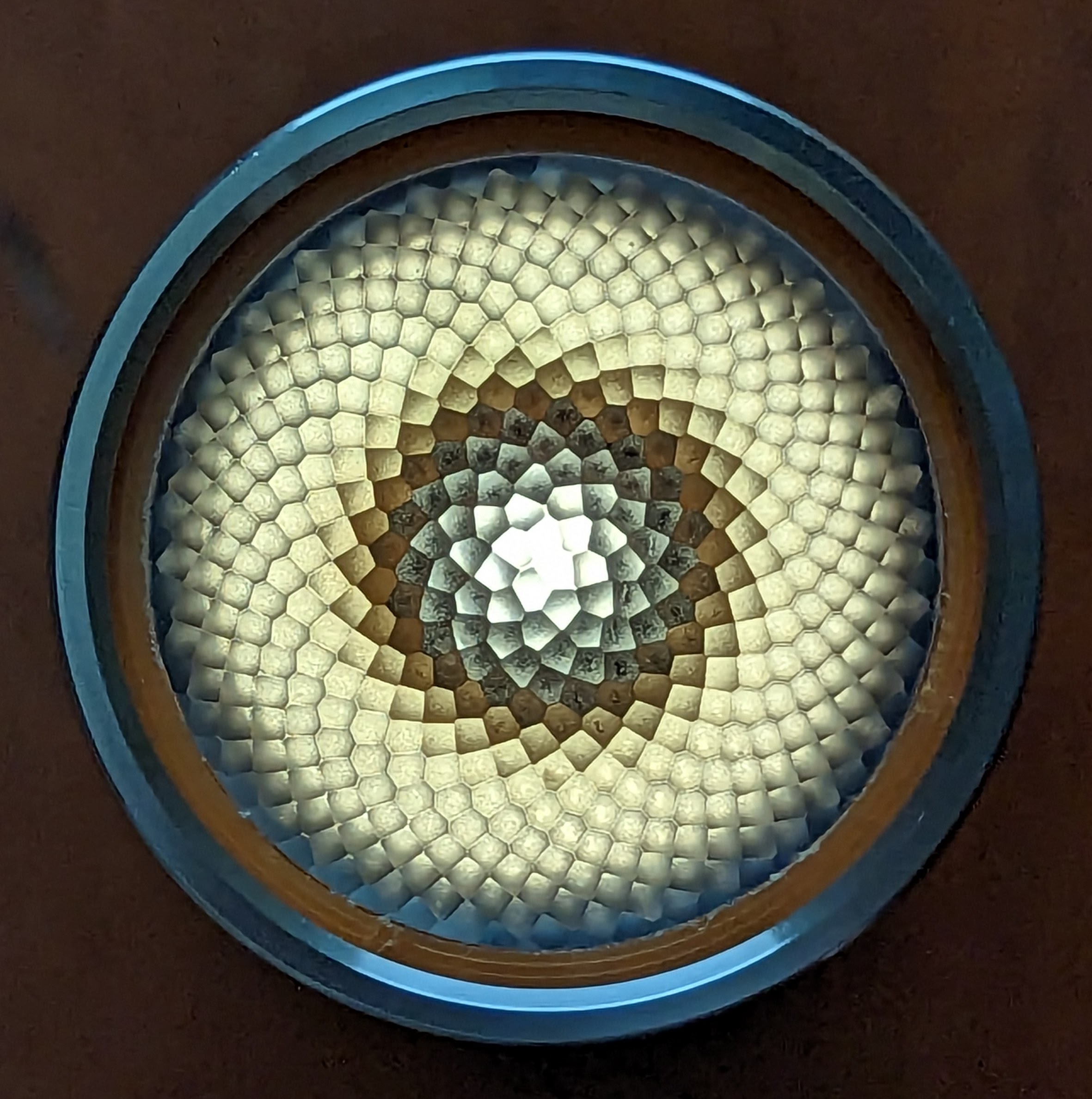
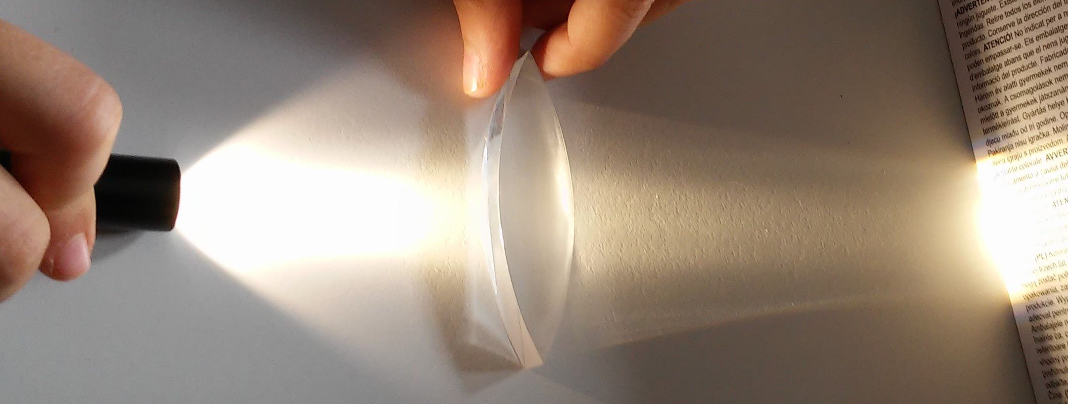
Failing that, I vote for the picture of the petal-like TIR, really beautiful.
It's a screenshot from The Lord of the Rings. While I agree that it was, indeed, hilariously awesome, I could also see some change being good as well.
Thanks for the reference, I actually don't remember any particular scene from LOTR with quite that look
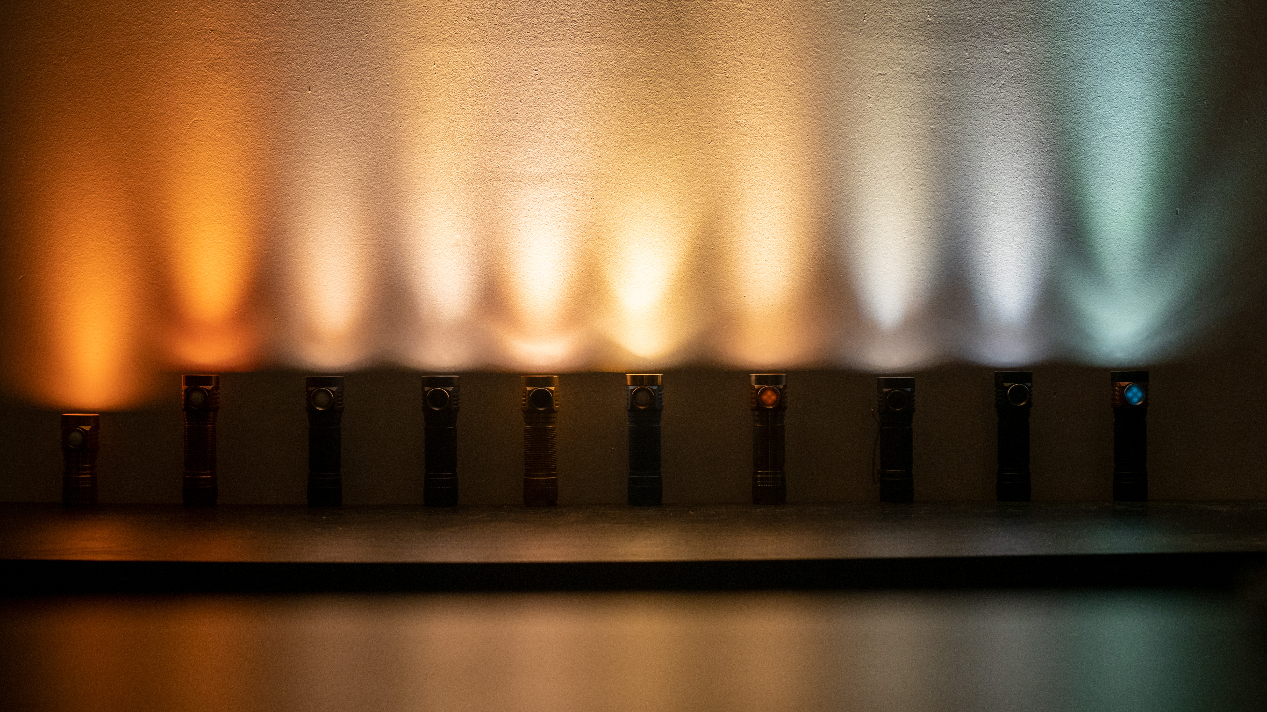
With 19 upvotes, this is the winner.
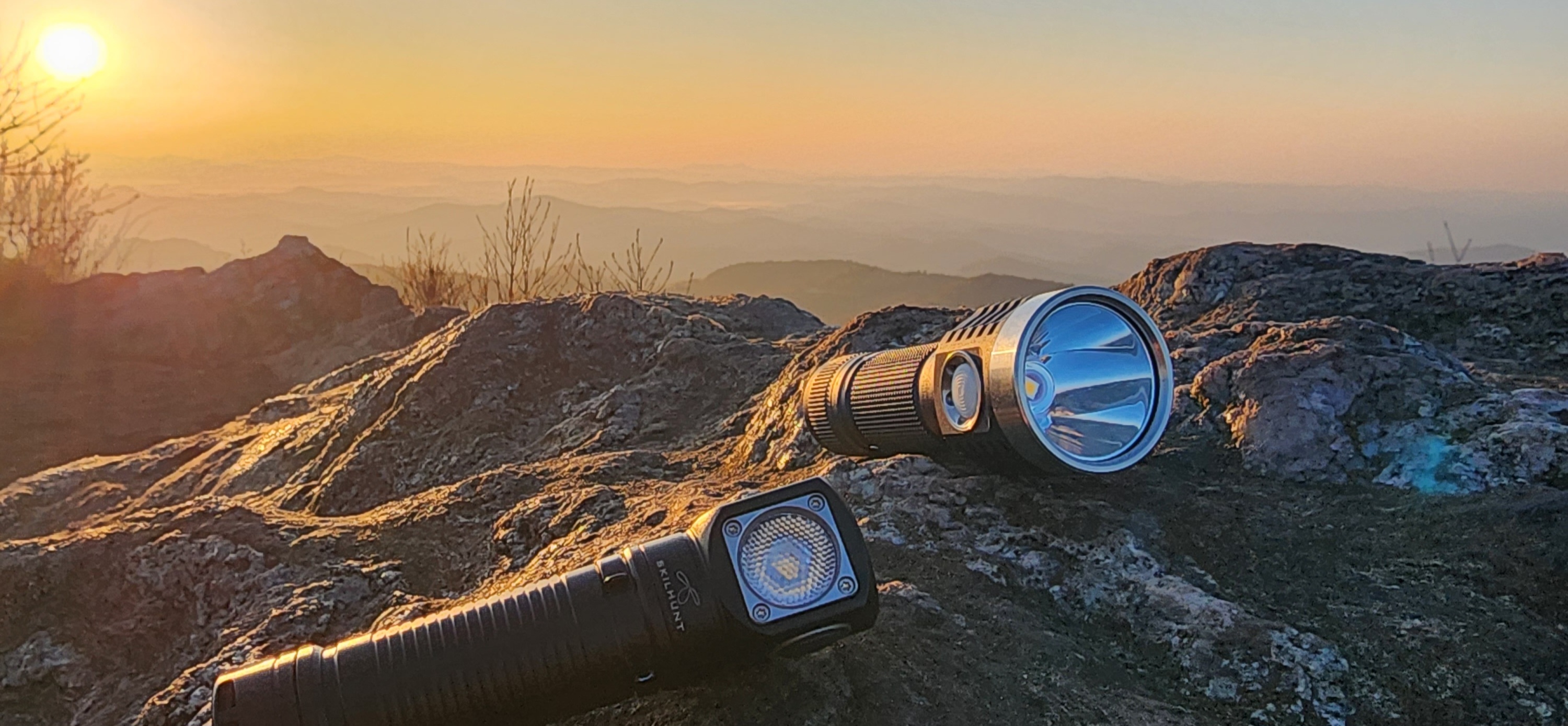

To clarify, it must be one image, which the Lemmy software will crop automatically. If we use this image, the desktop banner will be cropped like this (which may be acceptable, just to make sure you understand).

Got it. Was thinking it might be used for a squarer sidebar img, but that looks kind of cool as well. Thanks Zak!
Edit- 3:1 crop of original
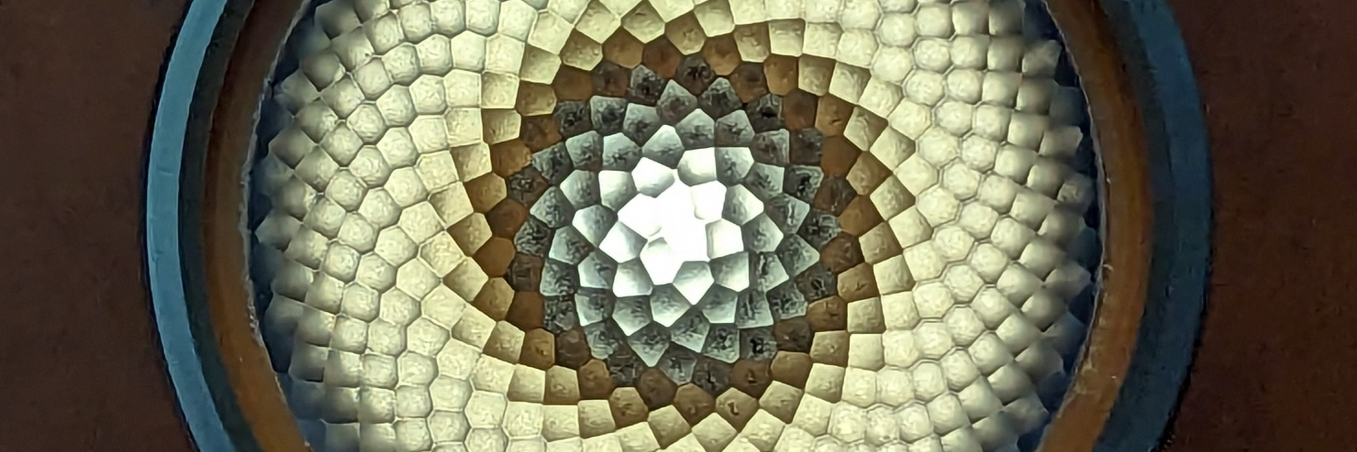
what light is that?
It's a Noctigon KR1 with the reflector swapped for a LEDiL TIR.
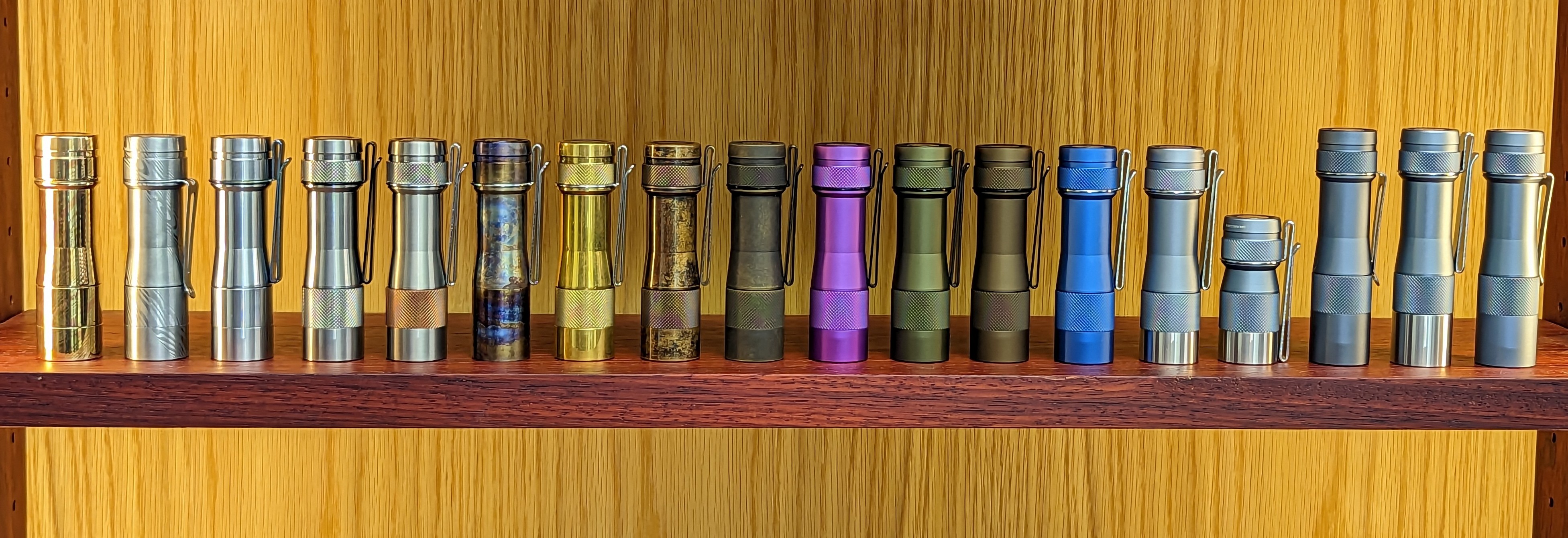
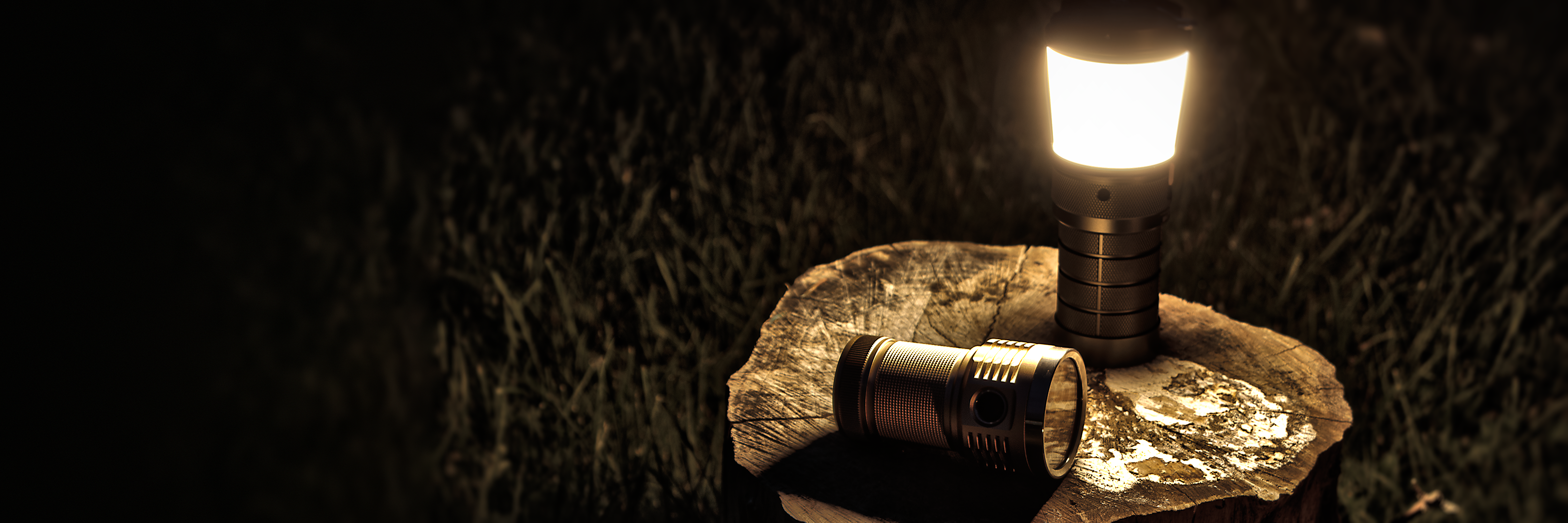
cropped to 3:1

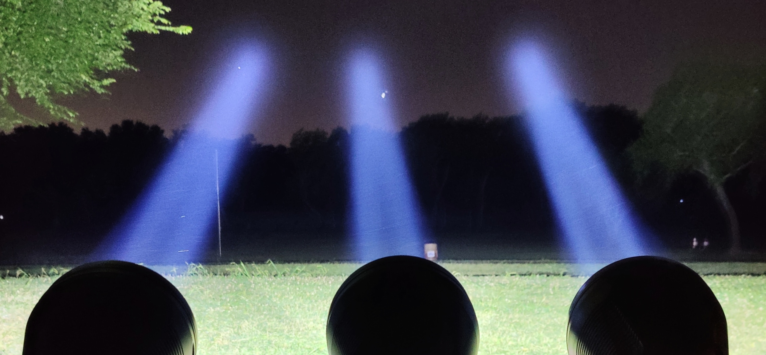
I approve of this one 🦀🦀🦀
🔦🔦🔦
🦀🦀🦀
Three of the four horsemen right there!
😂
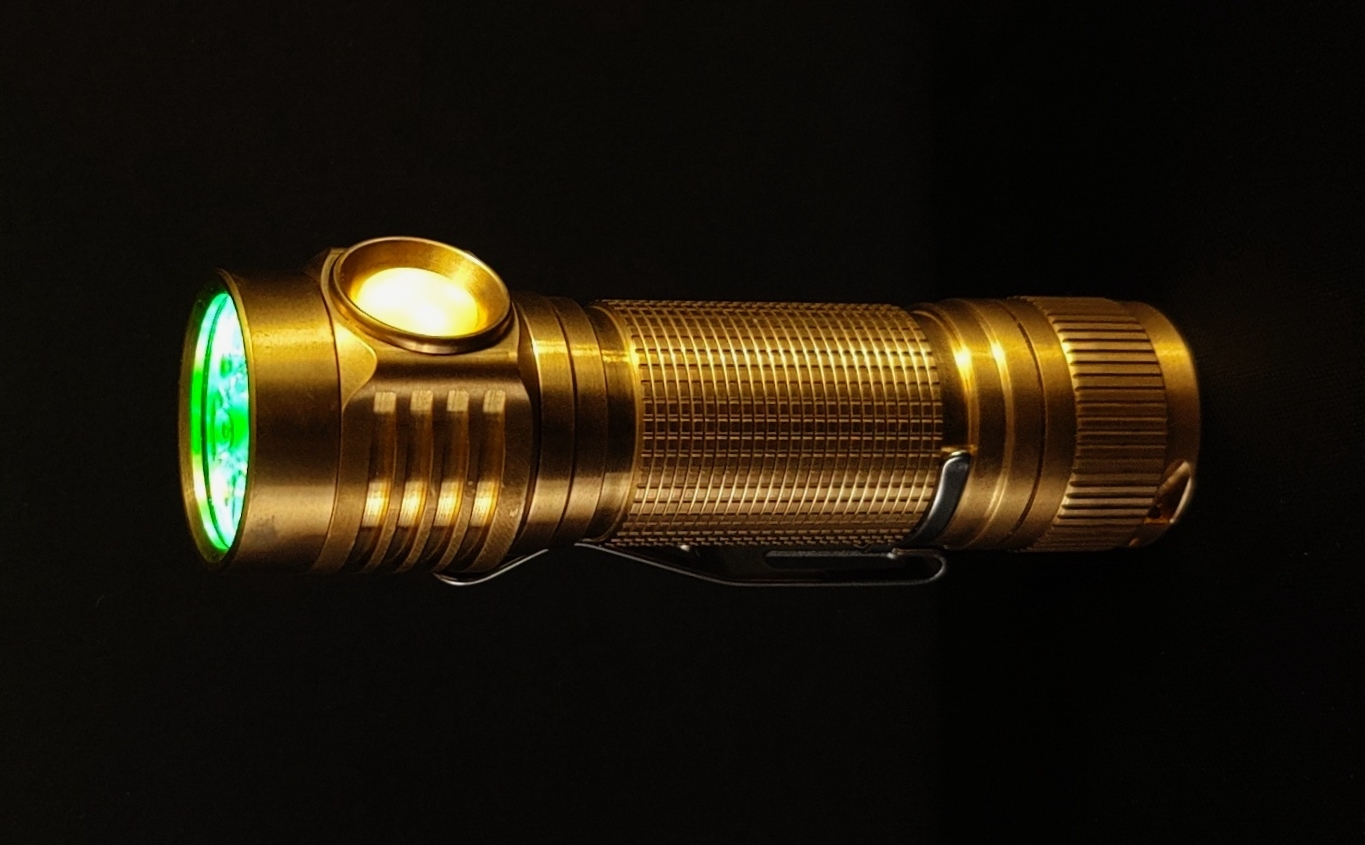
My brass D4
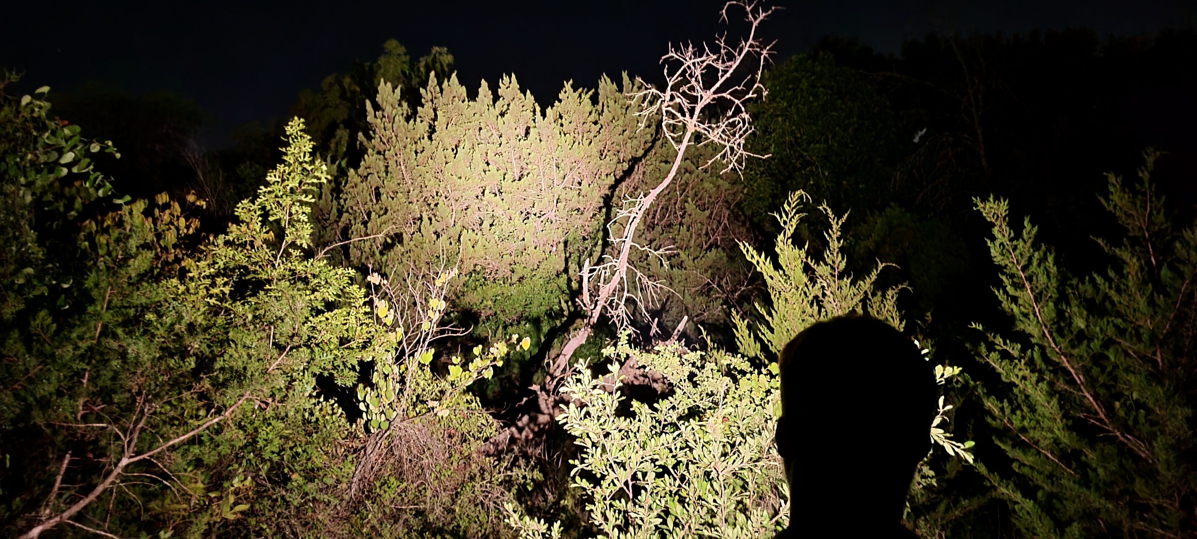
It's hard to make something work with a 3:1 and a square crop. Edit: changed the crop.

Nice.
Yes, the approach I took was to use an image with the subject smaller in the frame and a lot of foreground/background that's arguably pleasant to look at, but irrelevant.
 3:1 scale, perfectly crop-able (OC)
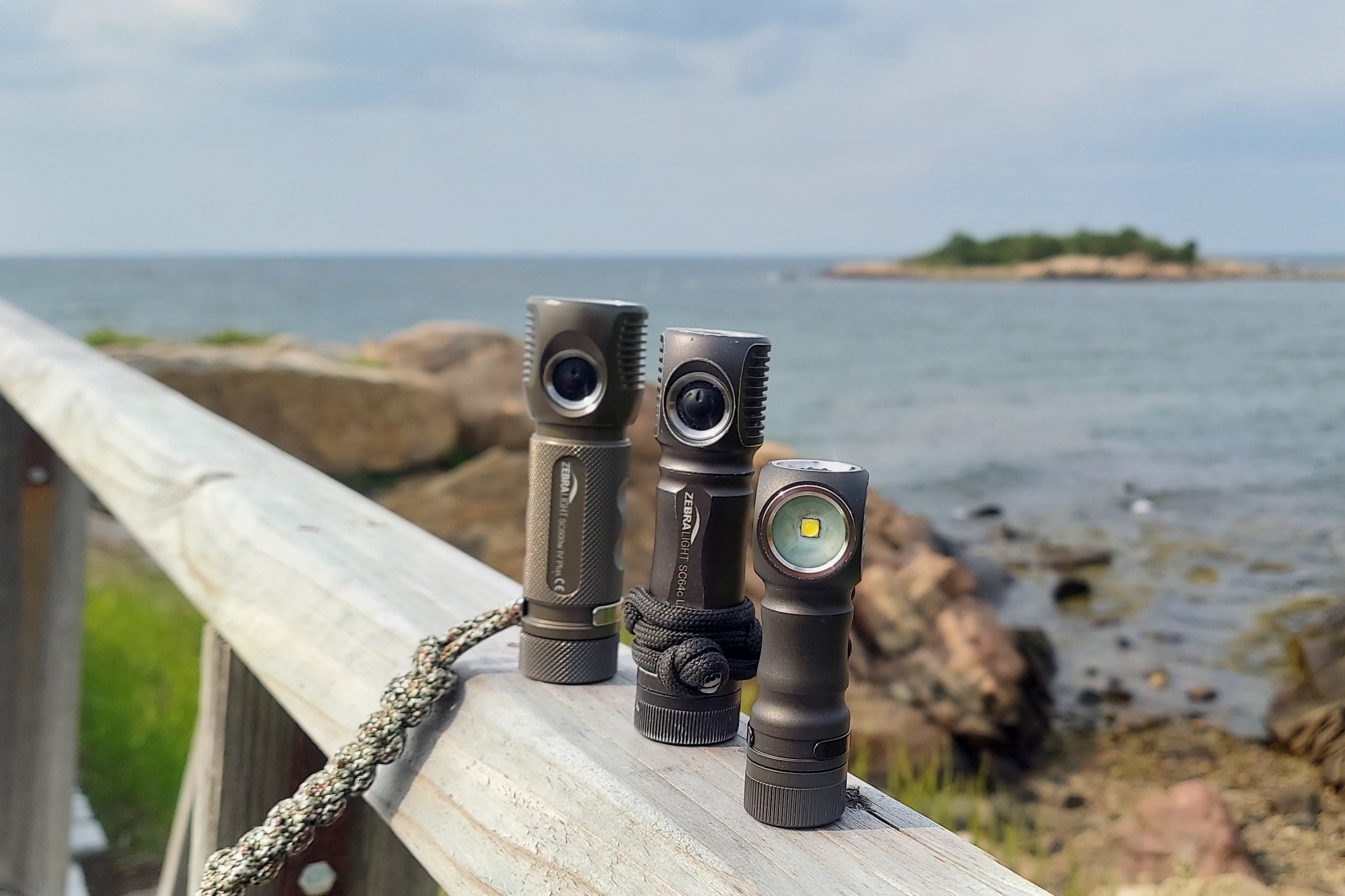
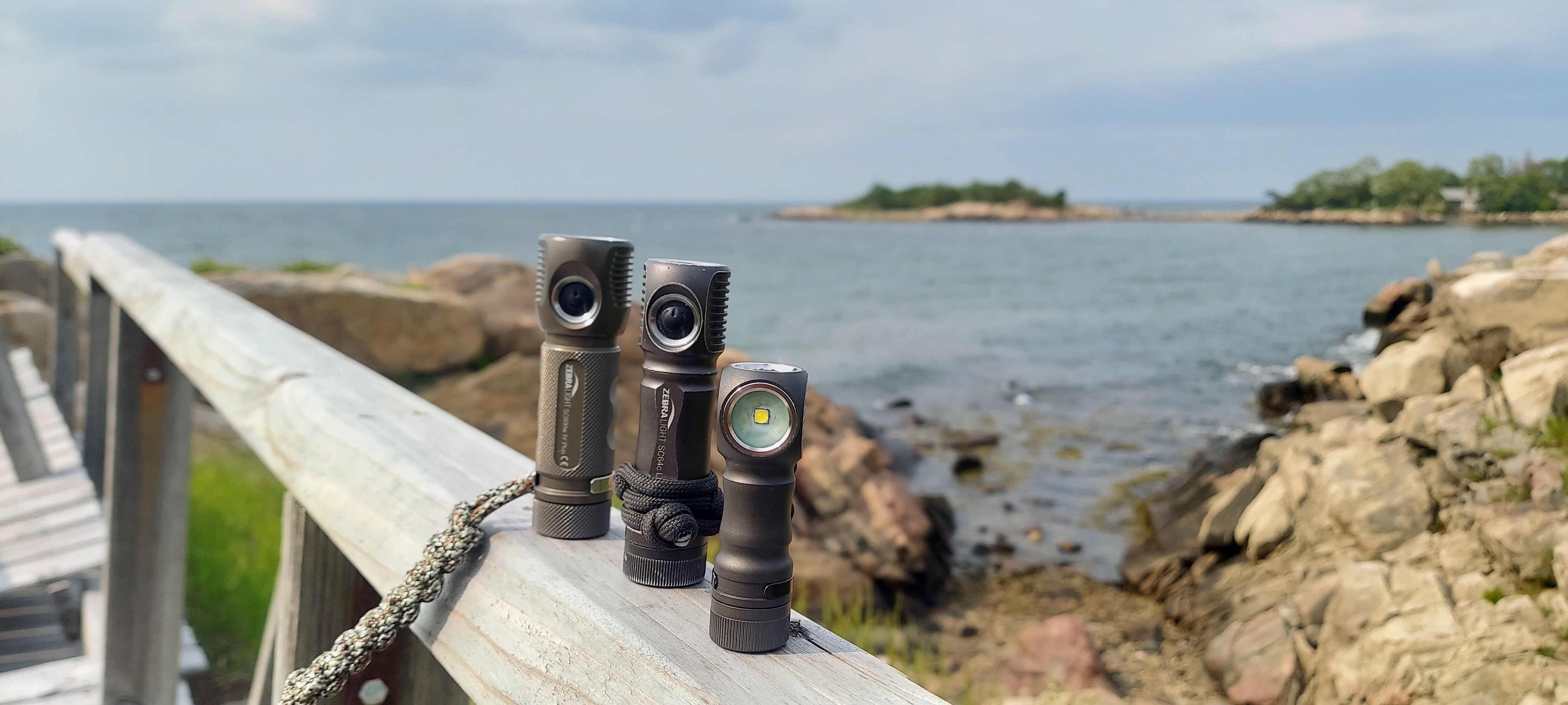
Squarer format (3:2) for mobile¿?


flashlight
Portable illumination
Rules:
- Be excellent to each other
- Don't be the reason we need to make more rules
Related:
