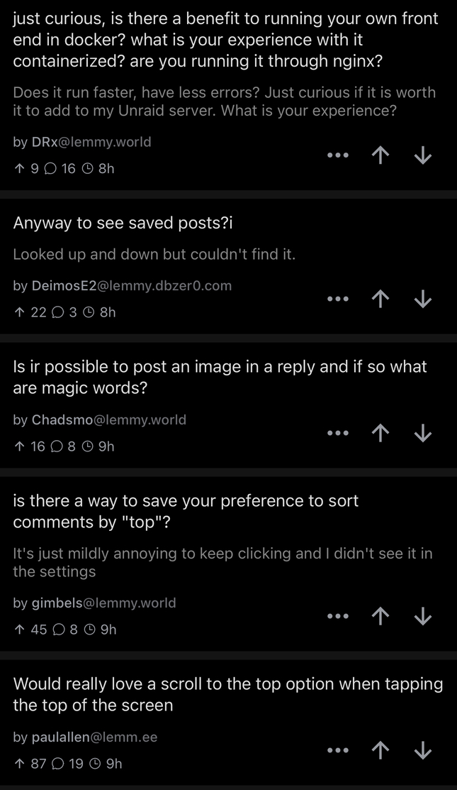
Came across a post while scrolling my home feed that had a screen shot of the WefWef view of a community’s posts as the image. Both my feed and the screenshot were dark theme, meaning it was nearly impossible to distinguish until I scrolled all the way to the bottom - obviously the poster had a longer phone than I do as the image took up the entirety of the screen and it just looked like WefWef was no longer displaying the community for each post. Super confusing.
I’ve added a screenshot of my own as the image for this post as an example.
I’ll go off now and find the post I’m referring to and include it with my edit.
Edit update: I can’t find the original post I’m referring to but my image does a good enough job showing the issue.
Not sure what to suggest as a fix or feature request - maybe just reduce the size of images slightly so they are little bit less than the full width of the display? All suggestions are welcome.


So the answers in this post are mostly that people are downvoting the bot because it is often wrong and then others defending it by saying “it’s not wrong it’s just based on American politics”.
If the bot reported from a range of sources that reflect a number of different political perspectives I’m sure it’d be more useful outside of the scope of American politics, and therefore wouldn’t get downvoted.
As far as I’m concerned the vote system is working as intended.
The internet is not American. There are no nations on lemmy ✌️