546
Crit fail
(media.piefed.world)
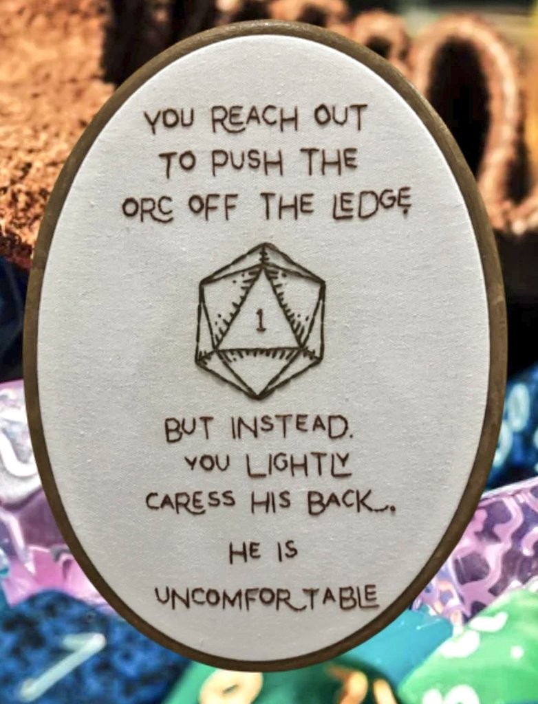
Man, if I rolled a 1 attempting to push someone off a cliff my DM would absolutely have me miss and stumble off the cliff.
Tbf I'd prefer that to stroking someone when I tried to shove them. Stroking them just isn't in the realm of possible outcomes when an experienced combatant tries to shove someone.
I initially thought this was a cat-related meme for some reason
This is why critical fails are usually so much better than critical successes. Lean into that shit hard!
"P...please stop caressing me. I'm trying to kill you!"
"Oh, you don't like that? You don't like mommy's strong hands rubbing your orc back? You don't want this little barbarian dwarf melting all the stress of battle away from you? Go ahead and tell me you don't really want it, bitch!"
And that's how we got an orc pet to follow the party around!
If that happened at my table, I would be as uncomfortable as the orc is.
you've gone in too deep. it would be awkward to stop now.
For a moment I was impressed at the stitchery but then I realized it wasn't real.
Is it not? Damn I wanted to praise the font and keming.
I like the font and kerning too.
But each individual letter is so exactly the same throughout, it is an "embroidery" font, not hand embroidery.
Hard to tell for sure bc the picture quality isn't great, but for example all the e's look pretty different, and the 2 g's look extremely different.
Check the o s, how they are all a little thicker than most of the letters, even though it's a simple letter. I hope I am wrong and they just have an unusual style and a very consistent hand.
I'm also unconvinced it's real. I'd like to see the back. Also, some of the stitches look like they might curve. Real individual stitches don't curve. It might be that there are many smaller stitches giving the illusion of a curve, but I can't tell at this resolution.
Like, I don't think it's AI, just photoshopped. I have an embroidery decorative frame very similar to this one, and the back of the frame shows through the front a tad, just like in this image. (at a guess, it's the Anchor 11.5" Faux Wood Oval Embroidery Hoop & Frame. I have the 7.5" in hand and the proportions on this image are wrong for that--the wood of the frame looks too narrow.)
Rolls 20: "but instead you lightly caress his back, and he likes it"?
I LOLd during a meeting because of this.
But you are not, this is what you wished for.
( ͡° ͜ʖ ͡° )
Humor, jokes, memes about TTRPGs
