6
Most Caring Cities in America
(cdn.wallethub.com)
I keep seeing all these charts in this sub and clearly lots of people haven’t studied how to present information properly. You can’t just put data out there with no axis or relative measurement and just slap numbers on it that’s just not good practice. If your graph can be misconstrued easily it’s a bad graph.
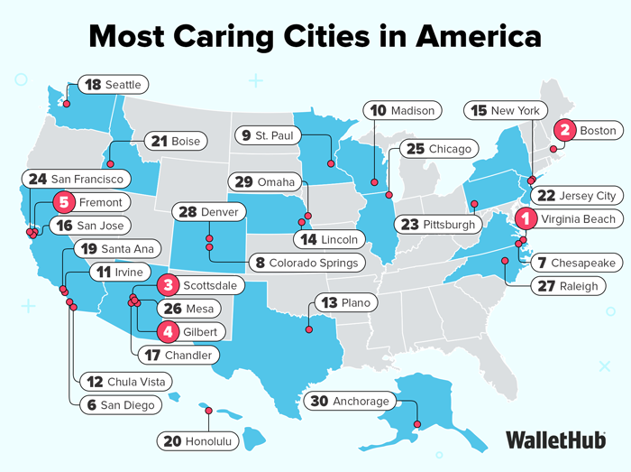
In order to identify the areas that care the most, WalletHub compared the 100 largest cities across 38 key indicators of a compassionate spirit. Our data set ranges from the share of sheltered homeless people to volunteering hours per capita to the share of income donated to charity.
There we go, that needs to be top comment.
Boston at #2? Was this a survey by white people, for white people?
yeah lmao i wanna know how this was measured
It was measured by YA MUTHA! GO SOX!
I never see any of these map things that seem correct.
Caring for what?
"failed to load media"
A place to share and discuss visual representations of data: Graphs, charts, maps, etc.
DataIsBeautiful is for visualizations that effectively convey information. Aesthetics are an important part of information visualization, but pretty pictures are not the sole aim of this subreddit.
A place to share and discuss visual representations of data: Graphs, charts, maps, etc.
  A post must be (or contain) a qualifying data visualization.

  Directly link to the original source article of the visualization
    Original source article doesn't mean the original source image. Link to the full page of the source article as a link-type submission.
    If you made the visualization yourself, tag it as [OC]

  [OC] posts must state the data source(s) and tool(s) used in the first top-level comment on their submission.

  DO NOT claim "[OC]" for diagrams that are not yours.

  All diagrams must have at least one computer generated element.

  No reposts of popular posts within 1 month.

  Post titles must describe the data plainly without using sensationalized headlines. Clickbait posts will be removed.

  Posts involving American Politics, or contentious topics in American media, are permissible only on Thursdays (ET).

  Posts involving Personal Data are permissible only on Mondays (ET).
Please read through our FAQ if you are new to posting on DataIsBeautiful. Commenting Rules
Don't be intentionally rude, ever.

Comments should be constructive and related to the visual presented. Special attention is given to root-level comments.

Short comments and low effort replies are automatically removed.

Hate Speech and dogwhistling are not tolerated and will result in an immediate ban.

Personal attacks and rabble-rousing will be removed.

Moderators reserve discretion when issuing bans for inappropriate comments. Bans are also subject to you forfeiting all of your comments in this community.
Originally r/DataisBeautiful