119

The new logo sort of looks like a white flag. It symbolizes the fact that Mozilla has just completely given up by now.
The new logo sort of looks like a white flag. It symbolizes the fact that Mozilla has just completely given up by now.
lmao
I mean, if the intention is to reflect the utterly bad decisions Mozilla has made, this new logo would be spot on
Ew the new one sucks. Why can't they spend the money that they have on important stuff instead of changing logos every couple of years? Uk, considering that their funding is going to dry up because of the Google anti trust case?
Because they don't have money
The font doesn't look too good
Not even Fira :/
and not Zilla Slab (which even had an opentype feature to replace “Mozilla” with “Moz://a”)
I do like the new logo, but it is a bit sad to see the :// gone.
Coincidentaly :/ is the symbol for "a bit sad"
Am I the only one who only sees a pitch black image?
Pretty sure it's black on transparent. Not the most visible, especially if your client makes the background black.
I switched to light mode to take a look at it and now I can confirm it looks absolutely terrible.
Can confirm, it looked better as a pitch black blob.
Ugh. Requiring your users enable light mode to look at an image is just cruel and unusual punishment...
I took a screenshot
You, my friend, are a truly unsung hero. ❤️
Also, damn, that's an ugly logo...
As a calligrapher, this is not pleasing to look at. Far from it.
Nope. I mean I don't really care. But it definitely doesn't appeal to me.
Does the flag look like a chicken to anyone else?
It's probably supposed to be a Godzilla-like creature.
 He's back from the dead!
My thoughts exactly. It's an underwhelming throwback in exchange for the pretty clever moz://a pun.
Thanks, now I can’t unsee it.
TBH, it’s better as a chicken
Also hier soll das neue eingebettet sein
![]()
Und das ist das alte
![]()
Das neue ist hässlich
What other problems left to solve? Right, let's change the logo.
Great sign that organizational resources are being arranged into a pointless circlejerk safely removed from browser & Thunderbird development, or finding opportunities to monetize that aren't products nobody asked for outside the nonprofit corporate bureacracy
I feel like we were just getting used to the old new logo?
It's possible this new logo is only for using next to other brands.
The flag looks like Nepal's flag.
The only REAL Mozilla logo

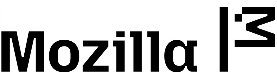
Why did they copy i3?
Is that last resort of mozilla foundation. That is futile. Every new update from then enshitify firefox also if google won't be able to pay browser owners to be default search engine, mozzila will drown without that money.
From Wikipedia, the free encyclopedia
Linux is a family of open source Unix-like operating systems based on the Linux kernel, an operating system kernel first released on September 17, 1991 by Linus Torvalds. Linux is typically packaged in a Linux distribution (or distro for short).
Distributions include the Linux kernel and supporting system software and libraries, many of which are provided by the GNU Project. Many Linux distributions use the word "Linux" in their name, but the Free Software Foundation uses the name GNU/Linux to emphasize the importance of GNU software, causing some controversy.
Community icon by Alpár-Etele Méder, licensed under CC BY 3.0