314

you are viewing a single comment's thread
view the rest of the comments
view the rest of the comments
this post was submitted on 22 Aug 2025
314 points (100.0% liked)
People Twitter
7989 readers
976 users here now
People tweeting stuff. We allow tweets from anyone.
RULES:
- Mark NSFW content.
- No doxxing people.
- Must be a pic of the tweet or similar. No direct links to the tweet.
- No bullying or international politcs
- Be excellent to each other.
- Provide an archived link to the tweet (or similar) being shown if it's a major figure or a politician.
founded 2 years ago
MODERATORS
The new one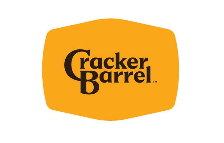
He was right. Jesus would never tolerate this. Time to flip some barrels.
It's on like Donkey Kong!
Tbf the old logo is much better
It's following the modern trend of flat clean lines. I'm getting rather sick of it TBH
soulless minimalism
I absolutely hate basically everything about modern logos and UI design. It looks like shit, and for UIs it's not even efficient usually.
It's better in some ways, worse in others. It's shit for a thumbnail, for example. The old one stand out more, but the new one is more readable and fits into any format.
Yeah, I think so too. I don't see why they had to change the font, at least the C had character. Now it's the most boring plain forgettable font imaginable and black at that. It's like they didn't even try.
Lmao they got rid of the cracker and the barrel
The barrel is still there. The background is a barrel.
I thought it was a cracker.
I'm pretty confident it's supposed to be a barrel, but it might also be a cracker. I can see that too.
What? How is this any « woke » even for the MAGA lunatics ??
[edit]: Apparently the company had a diversity / non-discrimination campaign in recent years. It explains.
Anything they dont like is "woke"
They had a DEI/nondiscrimination campaign because of several high profile stories where restaurants were accused of racism (black diners being asked to move away from seats visible from the entrance, at least one black person being told "we don't serve your kind" or words to that effect.)
Ugh I can just SMELL the WOKENESS. If I look at this ANY LONGER I might be AWOKENED
I mean, it's less visually noisy, but that's it?
This dude's willing to go to arms over this?
It makes the size of the logo versus the text look like nothing but wasted space. Hell, versus the text portion, it looks like MORE extra space is used than the old logo, ony with zero charm or familiarity to show for it.
If they wanted to re-brand as a truck-stop, merge with Love's, don't just rip-off their color-scheme minus the Heart.