Howdy all! It's taken me a while to get back to this for various life reasons, but I have finally collected all of the average scores (as voted by you and I) from the Post-Match Ratings, combined and then cultivated that data into a nice spreadsheet that I now cede to you all!
I have provided some screenshots and stats below for convenience but, feel free to peruse the link provided.
During the process, I went a little deeper and added additional things like wins/draws/loses, notes for goal scorers, tracked injuries, suspensions, benched players who didn't feature and so on. Those can be found on the other sheets in the document, along with all player scores and a summary I made on how I felt the season went in each competition.
Disclosure: The stats are purely based off of what was rated in the Post-Match Ratings as a collective and therefore is not necessarily representative of any one individual. It also doesn't factor in minutes played, substitutes, starters, dismissals, etc.
Overall Average Totals

- 🔺Denotes Out on Loan
- 🔻Denotes On Loan to the Club
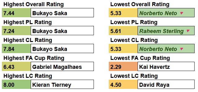
Saka takes the top spot with the highest Overall, Premier League and Champions League averages over 37 games.
Or did he?
Although only playing two games total, Nathan Butler-Oyedeji topped in the Overall, Premier League and Champions League Averages:

Kieran Tierney finished his Arsenal career featuring in 20 games with an average rating of 6.94, the 5th highest.
His highest score with 8.33, came in his MotM performance against Southampton in the final day of the season, his last in an Arsenal jersey.
Some other (potentially) interesting stats:
- PL Highest Score: 9.67 Bakayo Saka vs Nottingham Forest at Home
- Highest Overall Score (All Comps): 10.00 Declan Rice vs Real Madrid at Home and Ethan Nwaneri vs Bolton Wanderers at Home
- Lowest Overall Score (All Comps): 1.00 Mikel Merino vs Nottingahm Forest Away
- Featured Most: 56 Leandro Trossard
- Featured Once: 9 Ayden Heaven, Ismeal Kabia, Maldini Kacurri, Reiss Nelson, Norberto Neto, Josh Nichols, Jack Porter, Tommy Setford and Takehiro Tomiyasu
- Total Goalkeepers Used: 4 Norberto Neto (1), Jack Porter (1), David Raya (55) and Tommy Setford (1)
- MotM: Bukayo Saka was voted MotM 9 times, followed by Declan Rice on 8 and Ethan Nwaneri on 6
- Myles Lewis-Skelly was voted MotM with 6.38 despite getting a red card in the match against Wolverhampton Wanderers
I could spend so much more time delving into these stats, but this feels like it's getting long. So, let me know if there's anything else you want me to pick out. I still plan on tweaking and tinkering as I go.
I plan on doing the same again for this season. I have a template setup now, so I should be able to just put the data in and get most of what I'm after.
Let me know if there's anything else you'd like me to delve into or if you have any recommendations!
They should make it so that the customer says please and thank you instead. They're literally the one's asking for the service. I think its only polite, personally.