561
Just a quick reminder
(sh.itjust.works)
Look it's totally normal for it to curve a little bit okay
If it curves too much you may have a disorder that can be treated with medicine.

I think my favorite part of that is the pair of tiny hands passing that double deuce right back.
Destroy all technology
It's time to start over
If you need me, I'll be hunting and gathering
OK but what about HRT
That we can keep
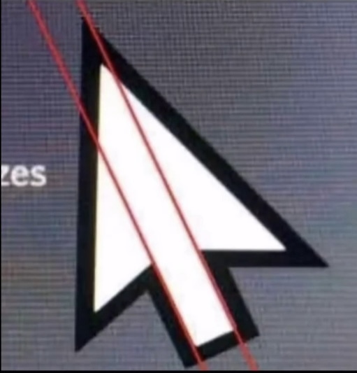
This was glaring when individual pixels were distinguishable.
The offset design is certainly on purpose.
Just like Tom Cruise's middle tooth
Just like Megan Fox's toe thumbs
Breeze (KDE) cursor forever!
good choice, but i'm a Bibata enjoyer myself.
It's a design choice! Engelbert & English probably thought real hard about this little "offset". To bring in more dynamic or something!
I like it because it points up, not straight.
Everyone loves a good upcurve.
I switched to a circular cursor and I love it so much. https://github.com/ful1e5/Google_Cursor
I might try that. Did it take much getting used to? What do you like about it more? Is it hard to "aim" sometimes?
I've had literally no problem with aiming in fact aiming is easier. It took no getting used to whatsoever. I changed it because I was doing a video demonstrating a feature on a touch screen but using a mouse and it seemed closest to the touch tracking while doing a screen recording on a phone. I found I liked it and had no desire to go back.
I like the symmetry quite a bit as well as how easy it is to identify things I can interact with (black dot inside) vs things that I cannot (black border). I also really dig the thick text cursor. My only complaint is the resize handle is not super obvious. It's kind of a lemon shape.
I'm about an hour into giving this circular cursor thing a try, and I think I'm a convert. You think it'd be hard to click on things given the overlap, but the color swap when you're over an interactable really sells it. Thanks!
years ago i read that the reason for the lopsidedness of the cursor was because of the old crt monitors. it just looked better having two edges being 'straight'; one exactly vertical up and down, one exactly horizontal, left to right; as those edges would have no 'jaggies'
rotating the pointer straight-up makes it look even more off-kilter.
https://files.catbox.moe/1dhu8r.png
Yeah, the fonts are lying to me all the time.
Squeezing a square about 1% helps it look more like a square; to appear the same height as a square, a circle must be measurably taller. The two strokes in an X aren't the same thickness, nor are their parallel edges actually parallel; the vertical stems of a lowercase alphabet are thinner than those of its capitals; the ascender on a d isn't the same length as the descender on a p, and so on.

What the fuck, I will never look at things the same way again.
God damn it
Wtf?!
Yeah if you use mcrosft 🤮
M*cros*ft
I'm okay with this.
LAMBS TO THE COSMIC SLAUGHTER!
Someone pls explain?
i believe it's just pointing out the misalignment of the graphic. people may be under the impression that something like a cursor has mathematically precise proportions, but it does not.
And it’s by design. Because if it was absolutely precise the edge wouldn’t have been straight
https://www.makeuseof.com/windows-default-cursor-why-asymmetrical-tilted/
yeah it has kind of an optical balance to it. i don't mind that it's not mathematically perfect because it appears proportional. optics are all that matters, especially in pixel art.
(edit: i guess 'pixel art' isn't correct anymore because it's a vector graphic, but it used to be pixels!)
At least back when it was pixelated you could still pretend it was centered
Behavior rules:
Posting rules:
NSFW: NSFW content is permitted but it must be tagged and have content warnings. Anything that doesn't adhere to this will be removed. Content warnings should be added like: [penis], [explicit description of sex]. Non-sexualized breasts of any gender are not considered inappropriate and therefore do not need to be blurred/tagged.
If you have any questions, feel free to contact us on our matrix channel or email.
Other 196's: