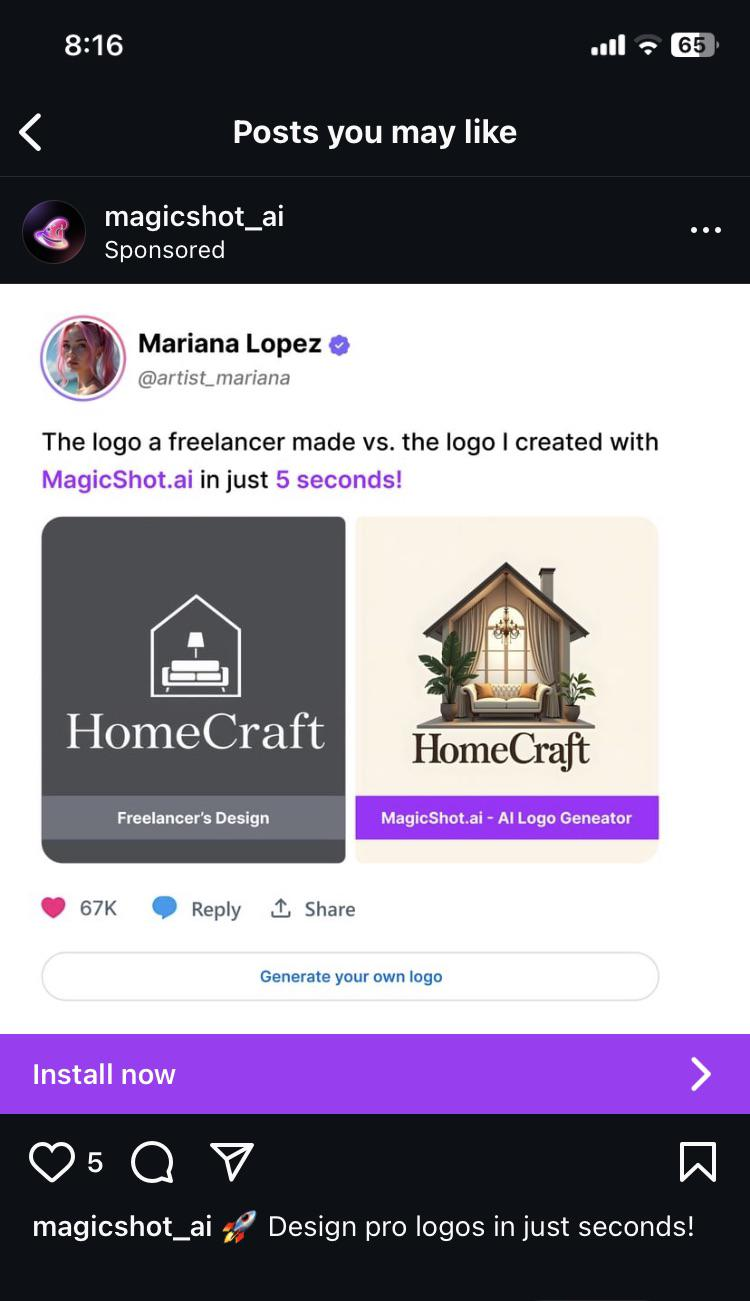
What is up with the weird soft look that so many AI images have?
It’s probably trained on a fuckton of Thomas Kinkade paintings, just statistically, since his output was so huge. He also had that kind of lighting going on, so it wouldn’t surprise me if that’s just baked into AI image generation now.
Interesting. Never heard of him, but immediately recognized the style
There’s a good couple of episodes from Behind the Bastards about him, if you’re into that sort of thing.
I'mma be honest: I compared the two logos before reading anything, and absolutely loved the one on the left. It made me instantly want to learn more about the company. The one on the right just looks like a low effort depiction of the inside of a house, and I lost interest in what it was offering before I even got to the company name. I clicked in the post to put in my 2 pence, then read the whole image. Yeah... AI sucks.
Sometimes I think the AI bubble is about people who don't understand computers being put in a kind of purgatory where they have to work out why everything is wrong and bad.
Spoken like someone who has no clue about graphic design
The Dunning-Kruger tool.
Mariana Lopez should have at least said which freelancer she got the sample from. What an insult to their work.
That thing just screams AI slop.
I hate that some real people actually think like this and don't see the problems here.
I know, that's not the point of this post, but does anybody else miss, when logos had more than 2 colours? I see it as a sign of enshitification. Every company now has a monochrome logo made of simple shapes, so it's cheaper to print on t shirts and easier to spot on a phone screen.
Right? I miss fun logos. I get everyone wants to shit on ai but minimalist logos are booooooring
Fuck AI
"We did it, Patrick! We made a technological breakthrough!"
A place for all those who loathe AI to discuss things, post articles, and ridicule the AI hype. Proud supporter of working people. And proud booer of SXSW 2024.
