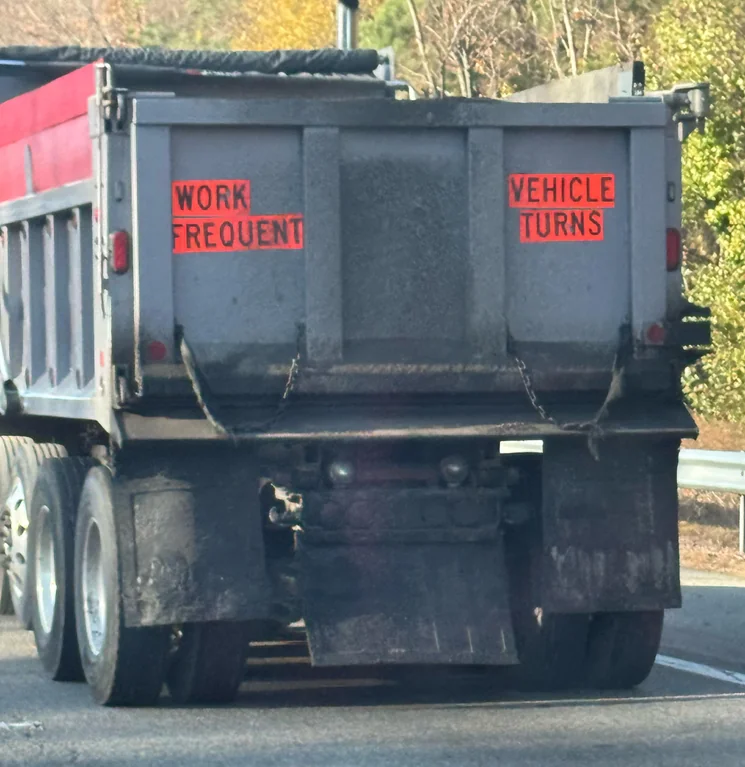
I would certainly hope it do
screams in train
Lol, vehicle turns! Man, what a time to be alive.
Sorry, it sounds like something the youths would run around saying while giggling.
same message, different packaging
I get mad at bad safety communication. Who gives a shit it’s a work vehicle? Just write “keep your distance, frequent stops and turns”. A placard with a symbol showing distance between vehicles and it would be even better.
I feel like "work vehicle" is also pretty obvious given that it's, y'know, a dump truck. I don't think many people drive dump trucks recreationally...
Looking at the image, whoever put those signs didn't had the slightest clue on what they were doing.
You need the information concentrated in an easy to read and perceive cluster; best placement here would be at the center panel. Visual signs of danger should have been placed on the sides, as visual information is processed faster.
And where are the standard warning signs?
NoSafetySmokingFirst
Welcome to NoSafetySmokingFirst!
For images where the text reads correctly left to right, but visual cues (like colouration, vertical proximity, or horizontal separation) lead you to try to read it top to bottom.
This is similar to, but distinct from, the more widely known “DontDeadOpenInside” format. In that case, the text reads correctly top to bottom, but visual cues (like colouration, horizontal proximity, or vertical separation) lead you to try to read it left to right.
The post that started it all:
Other related communities:
- !dontdeadopeninside@lemmy.ohaa.xyz
- !yelldowlgyel@sopuli.xyz (letters arranged in any confusing order)
