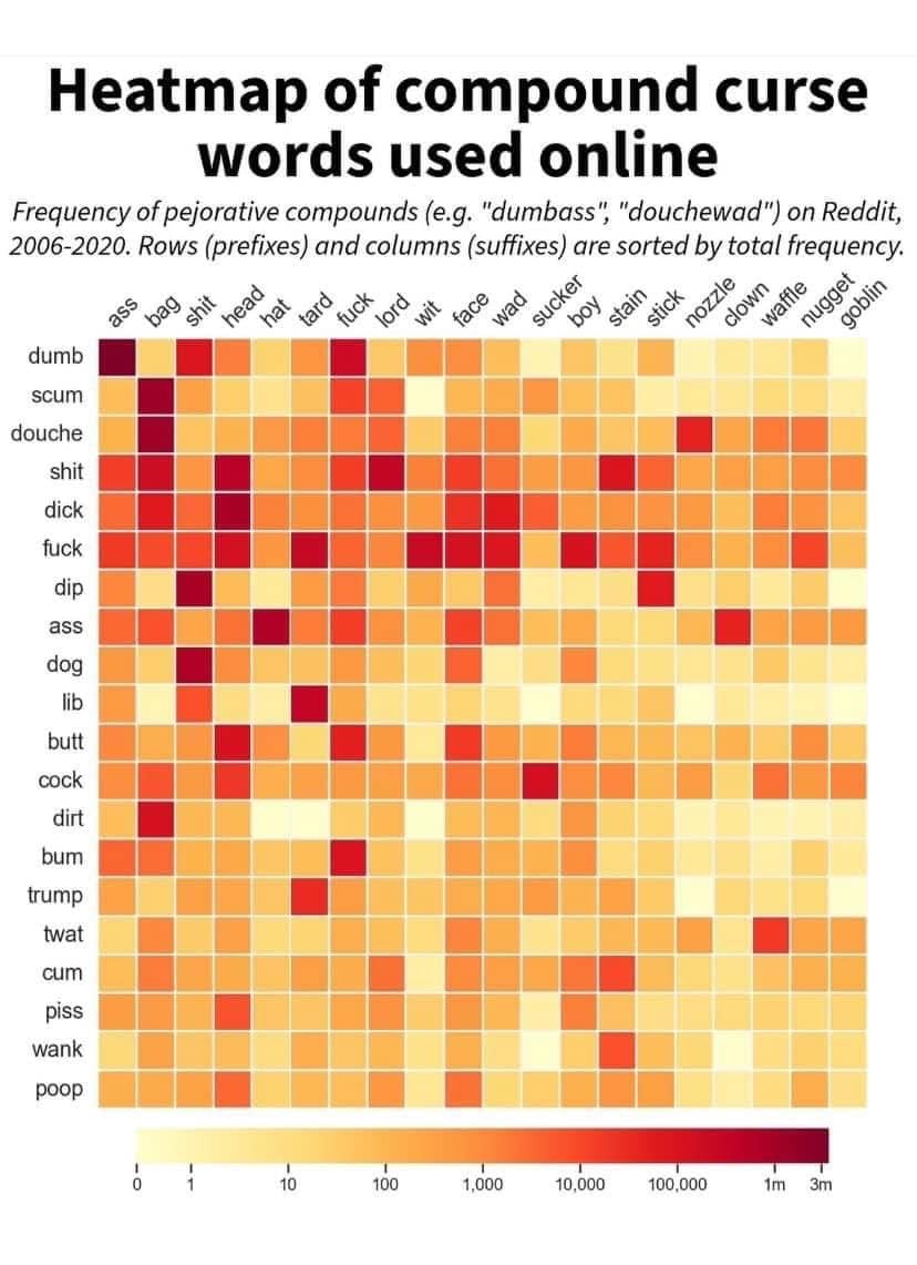
How come I’ve never used twatwaffle before?
I felt the same of poop goblin. Although Trump hat caught me off guard
Just kind of rolls off the tongue doesn't it? Lovely alliteration.
Dog lord isn't exactly high frequency, but it's higher than I would've guessed.
Shitlord is surprisingly common
As is trumptard.
I can see why scum wit or dirt tard isn't used often. But lib sucker, in right wing areas?
Ooh, going to add bumgoblin to my repertoire
I'm stealing fuck sucker
Wait, no one is gonna talk about twat waffle? how does waffle become a curse word?
Today i learned...
A few new insulting word combinations. Today was a good day .
No cunt? I feel like cunt should be on both axis!
Oh, new combos all over!
"Nozzle Goblin"
The issue is they don't know the context these words are used in. Stain could be talking about how to remove a tough stain on clothing. Waffle could be people cooking waffles, etc
It's specifically using compound words of the left + top words together, so I think that's already filtered out save for typos, very specific stains, and eccentric breakfast option
Omg I looked at this early in the morning. Didn't even realize it was compound words. Fuck me I'm nothing but a scumwaffle douchelord
Hey Jeff did you clean the waffenozzle in time for the rush? We need that batter to dispense cleanly and evenly.
As a profanity enthusiast this is relevant to my interests, you scumwit dirttard wanksucker.
you can tell this is heavily US-oriented since there is no word for leftists. there's just "lib-" for liberals, and "trump-" plus 18 others for conservatives.
Dipfuck??
I tried to share this on facebook.
They removed it for "bad language"
so many combos, definitely saving this chart!
Is fuckboy really a curse word?
Data is Beautiful
A place to share and discuss visual representations of data: Graphs, charts, maps, etc.
DataIsBeautiful is for visualizations that effectively convey information. Aesthetics are an important part of information visualization, but pretty pictures are not the sole aim of this subreddit.
A place to share and discuss visual representations of data: Graphs, charts, maps, etc.
  A post must be (or contain) a qualifying data visualization.

  Directly link to the original source article of the visualization
    Original source article doesn't mean the original source image. Link to the full page of the source article as a link-type submission.
    If you made the visualization yourself, tag it as [OC]

  [OC] posts must state the data source(s) and tool(s) used in the first top-level comment on their submission.

  DO NOT claim "[OC]" for diagrams that are not yours.

  All diagrams must have at least one computer generated element.

  No reposts of popular posts within 1 month.

  Post titles must describe the data plainly without using sensationalized headlines. Clickbait posts will be removed.

  Posts involving American Politics, or contentious topics in American media, are permissible only on Thursdays (ET).

  Posts involving Personal Data are permissible only on Mondays (ET).
Please read through our FAQ if you are new to posting on DataIsBeautiful. Commenting Rules
Don't be intentionally rude, ever.

Comments should be constructive and related to the visual presented. Special attention is given to root-level comments.

Short comments and low effort replies are automatically removed.

Hate Speech and dogwhistling are not tolerated and will result in an immediate ban.

Personal attacks and rabble-rousing will be removed.

Moderators reserve discretion when issuing bans for inappropriate comments. Bans are also subject to you forfeiting all of your comments in this community.
Originally r/DataisBeautiful
