52
fellas, is this true?
(lemmy.blahaj.zone)
Discussion of climate, how it is changing, activism around that, the politics, and the energy systems change we need in order to stabilize things.
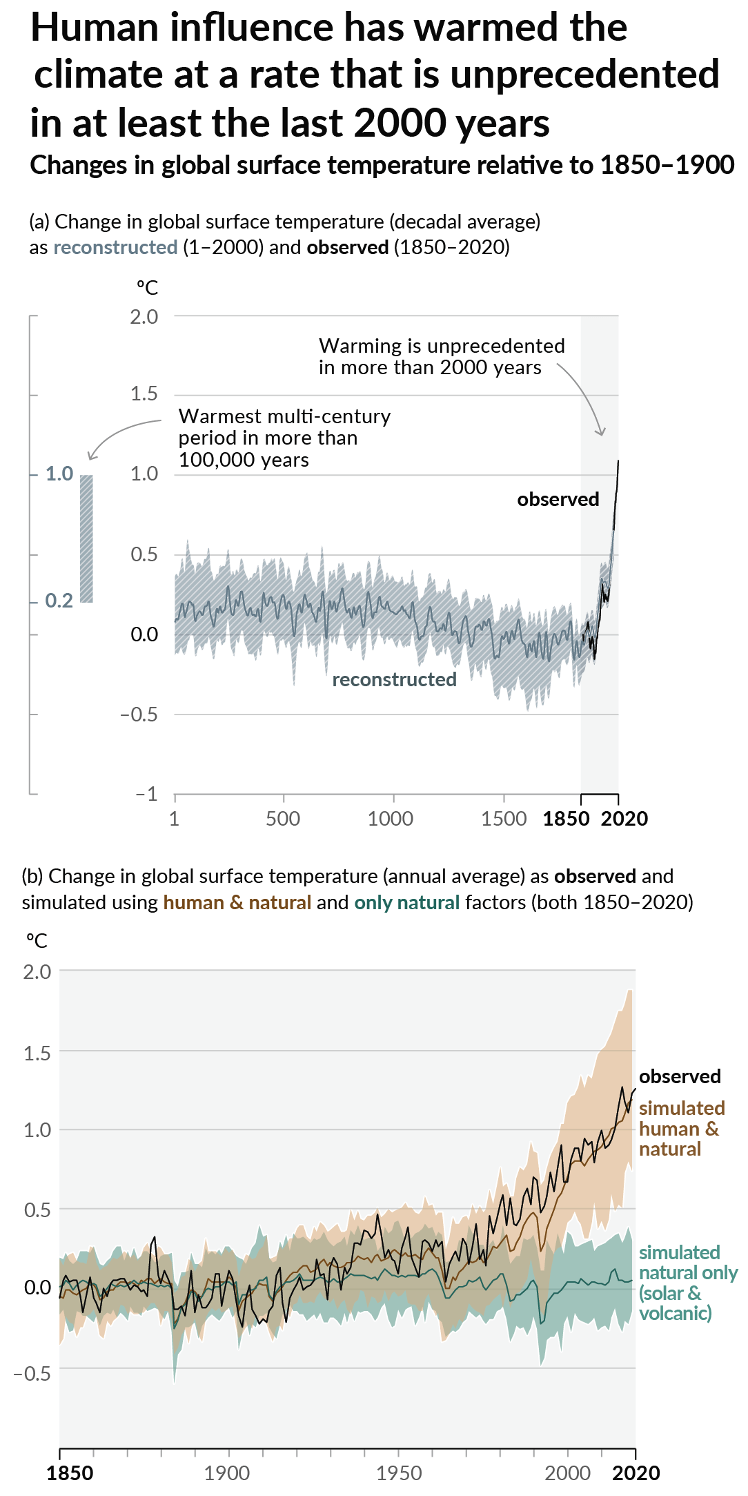
As a starting point, the burning of fossil fuels, and to a lesser extent deforestation and release of methane are responsible for the warming in recent decades:

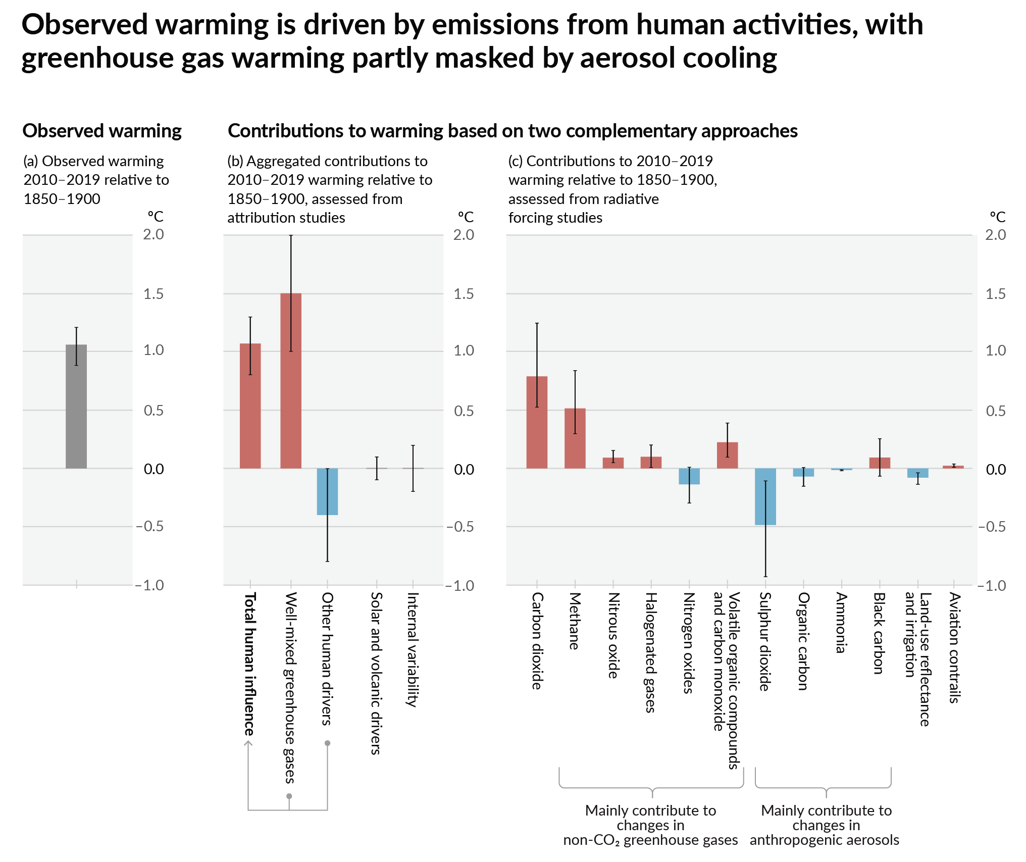
How much each change to the atmosphere has warmed the world:

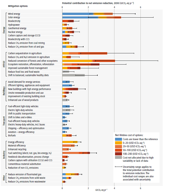
Recommended actions to cut greenhouse gas emissions in the near future:

Anti-science, inactivism, and unsupported conspiracy theories are not ok here.
Banning studded tires because they're obviously worse from the perspective of a highway maintenance engineer who wants to minimize repaving costs is one thing.
Banning them because they're worse than regular tires specifically in terms of dust generated isn't the same thing, and (as a traffic engineer myself) I'm not sure that specific issue has been studied all that much.
Think of it this way: consider all the different possible combinations of road surface and wheel material, and the amount of dust (ablated from the wheel or from the road) they might generate: knobby tires on dirt, slick tires on asphalt, studded tires on snow, every combination of the above, et cetera. I don't know what the contours of that graph would look like. If you think about adding more and more metal to the tires (and to the road), at the limit you've got a railroad and the amount of dust generated would hit a minimum. But what's the shape of the metal content vs. dust curve from "high-mileage/low rolling resistance tire" through "studded snow tire" to "train wheel," and how does it vary depending on surface? I'd be surprised if anybody has rigorously tried to answer that question. It feels like the kind of research that would put somebody in the running for an Ig Nobel Prize, to me.