1502
Anon notices what they've taken from us
(sh.itjust.works)
This is a place to share greentexts and witness the confounding life of Anon. If you're new to the Greentext community, think of it as a sort of zoo with Anon as the main attraction.
Be warned:
If you find yourself getting angry (or god forbid, agreeing) with something Anon has said, you might be doing it wrong.
Holy crap that did it! Thank you!!
That seems like a weird thing to want. You'll have less screen space because the notification area is now using your useable screen area instead of being up in the unusable dead space.
MY. MEMES.
Not actually how it works. There's two options. One of them has the notifications in the "dead space", but the content never gets eaten up.
(Pinging @EdibleFriend@lemmy.world , just in case you didn't know about this!)
I wouldn't use this myself. Most apps are designed so content fits underneath the camera hole so nothing gets eaten, and even if it does get eaten, the camera is so small that it's not an issue for me
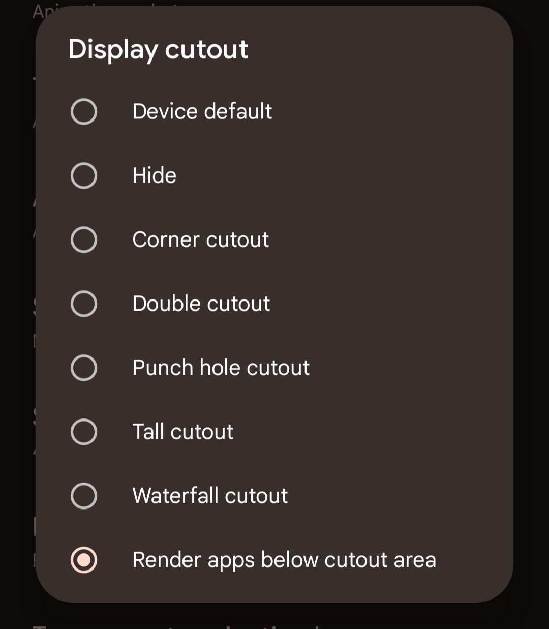
Edit: this is what you have to enable, by the way.
