3
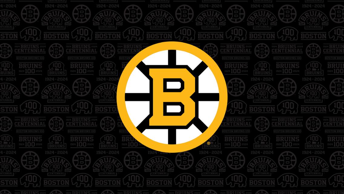
Bruins Unveil Centennial Crest
(lemmy.world)
Article says that the modern Spoked-B will be replaced with this fresh take of the Spoked-B for the 100th season. I am a huge fan of the modern Spoked-B but I really like this take on it.
I'm not really a fan of this one. I understand we can't have everything the same forever, but this reminds me too much of the Meth Bear logo.
In regards to the colors? Everyone's entitled to their own opinion but I don't see the correlation. I think this is simple and well designed with attention given to the history of the Spoked-B. Meth bear is just a disaster of a logo. It's awful. I know the cool thing is to like it because it's so bad but I hate meth bear with a passion. Same for the fleet center era drowsy bear.
I'm a huge fan of the modern Spoked-B though so I'm glad they're saying it's only going on a hiatus for the centennial season.