264
you are viewing a single comment's thread
view the rest of the comments
view the rest of the comments
this post was submitted on 16 Jul 2023
264 points (100.0% liked)
Mildly Interesting
17322 readers
22 users here now
This is for strictly mildly interesting material. If it's too interesting, it doesn't belong. If it's not interesting, it doesn't belong.
This is obviously an objective criteria, so the mods are always right. Or maybe mildly right? Ahh.. what do we know?
Just post some stuff and don't spam.
founded 1 year ago
MODERATORS

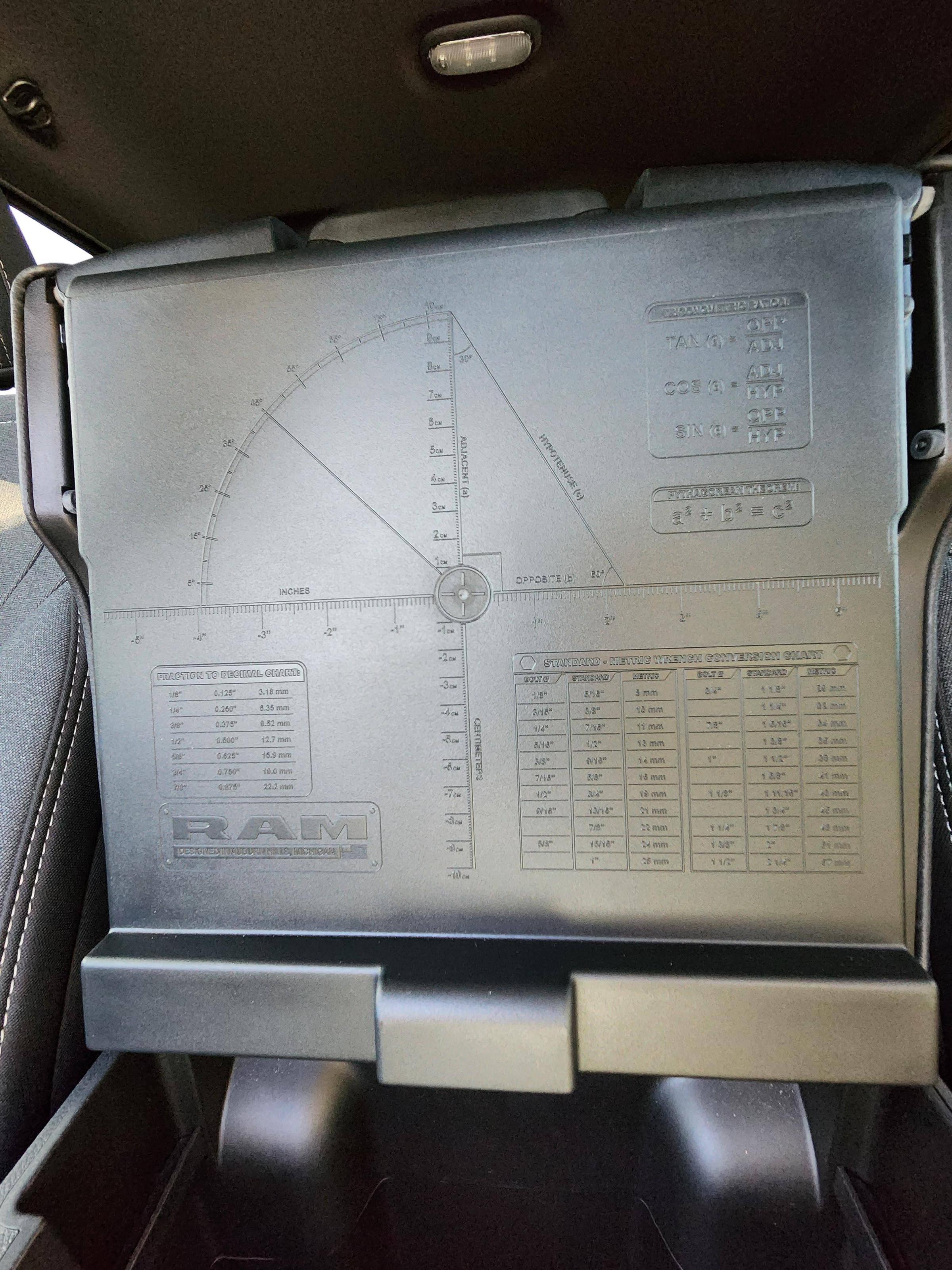
They certainly used a lot of space to give the trigonometry lesson. It seems like it would be useful to skip that section and make the metric conversion charts bigger and easier to read.