93
submitted 1 year ago* (last edited 1 year ago) by kuro_neko@lemmy.ca to c/lemmyconnect@lemmy.ca

Hi, thanks for all the great feedback on the last release. This release brings hide post functionality and improvements to the about instance page.

We also hit 20k active users! That's an amazing milestone for only being live for about 2 weeks. I'm going to be working on a 'New to Lemmy' onboarding page as Connect is often the first place for new users. Also customization for swipe actions is high on my list to do.

What's new

  • Smoother swipe navigation on certain pages
  • Fixed typo in Settings page (Affects -> Effects)
  • Made scrolling up smoother in full width view
  • Added ability to hide posts (it's both the last swipe action and on the hamburger menu)
  • Added a list of communities to the instance about pages
  • Added user avatar to the drawer header
  • Vibrate on comment collapse/uncollapse

Bugfixes

  • Fixed a bug with getting next page is the entire first page is filtered
  • Fixed a bug for users with >100 subscriptions
  • Fixed a bug with sort values not taking effect -Changed the app name on the homescreen to just 'Connect'
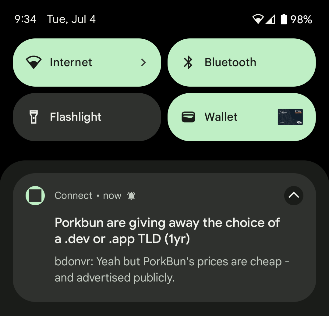
  • Added a notification outside of drawer
  • Fixed a bug where sometimes comment replies wouldn't show the comment being replied to
  • Addressing some logo feedback, I've removed the outer white ring

edit: 1.0.58 hotfix is waiting on Google Play approval now which fixes a couldnt_load_comment bug.

Links:

-kuroneko

top 42 comments
sorted by: hot top controversial new old
[-] LazyKatze@lemmy.fmhy.ml 6 points 1 year ago* (last edited 1 year ago)

Love the app so far...

I see that after today's update the images are no longer being cropped, instead the full picture is displayed albeit small to fit the given space for each post.

Would it be possible to add an option to have the pictures displayed bigger? Right now it you are force to enter a post to see the picture properly. I get that for some it would mean a less clean look but set as a toggle option would be great.

Would also be great to let the Community name and user name be direct links, instead of now having to press the menu (3 dots) to navigate to the corresponding page.

An option for the top bar to not dispear when scrolling would be nice as well.

Also any thoughts on having a preview of how the settings affect post/comments?
[-] RxBrad@lemmy.world 4 points 1 year ago* (last edited 1 year ago)

I actually kind of like the current Card View (I was never a fan of how much images were cropped in the previous versions), but I would also like an option for full-height images, stretched to the card's width. Similar to what we see in Fullwidth view.

[-] LazyKatze@lemmy.fmhy.ml 4 points 1 year ago

Oh yeah, don't get me wrong it is definitely an improvement to previous versions ๐Ÿ˜Š

[-] OneDimensionPrinter@lemm.ee 2 points 1 year ago

And this is why I love 3rd party apps so we can customize this kind of thing :)

[-] tsz@lemmy.world 6 points 1 year ago

Really need an option to adjust how nested comments look. The bright colors/thick lines absolutely wreck my eyes in the dark and just kind of look tacky. It'd be great if I could just pick the color and weight of the line, but I'd be fine if you just toned the same down.

[-] Angelus1727@lemmy.world 2 points 1 year ago

I second this. Thinner lines with weak colours would be great or even better, let us customise in settings.

[-] calr0x@sh.itjust.works 6 points 1 year ago

Feature Request: Top last 6 hours

[-] LazyKatze@lemmy.fmhy.ml 2 points 1 year ago
[-] s6original@lemm.ee 5 points 1 year ago

Looks great but it's broken. Can't get content on comment pages.

[-] kuro_neko@lemmy.ca 3 points 1 year ago

Is that on a certain instance? I just tried it on a couple servers and it seems working

[-] s6original@lemm.ee 5 points 1 year ago

Seems everywhere to me. Page briefly displays before displaying "couldn't get content".

[-] Xepher@lemm.ee 3 points 1 year ago

Having the same issue here. Can't load comments from any instances I've tried. My home instance is lemm.ee if that matters.

[-] kuro_neko@lemmy.ca 10 points 1 year ago

Ok thanks! I'm rolling out a hotfix now (should be live in about 2 hours). I see lemm.ee is on API version 0.18.1-rc.4 so my suspicion is any instance on that version will have this issue. (The issue was that Connect was trying to load too many comments at one time, which was okay prior to today).

[-] s6original@lemm.ee 2 points 1 year ago

Thank you. Your app is looking fantastic.

[-] Xepher@lemm.ee 2 points 1 year ago

You the man! Super fast diagnosis and fix. Much appreciated ๐Ÿ˜

Loving your app so far!

[-] OneDimensionPrinter@lemm.ee 1 points 1 year ago

You're a gem! Thank you!

[-] RojaBunny@lemmy.world 1 points 1 year ago* (last edited 1 year ago)

I'm getting this too, every post "couldn't_get_comments" and if I hit refresh it takes me back to the homepage filtered by Active.

Lemmy (and lemmy.world) work fine in my browser but the app is completely not working.

[-] RxBrad@lemmy.world 4 points 1 year ago

Looking good.

I will note that the notification badge is just a black box.

Also, on the "would be nice to see" list, the Profile page could us some love. (Ability to edit your profile, tabs for comments vs posts, maybe some fancy stuff like things you've favorites)

[-] SoulKeeper@lemmy.world 4 points 1 year ago

Do you have any plan to make this app open source?

[-] fedev@lemmy.world 3 points 1 year ago

Now I have yet another Connect App...

[-] Falafels@lemmy.world 3 points 1 year ago* (last edited 1 year ago)

Loving the app so far - very clean, beautiful design.

I have a small feature request, if I may. Could there be a way to have unread comments in a thread you've viewed before be highlighted in some way so they're easier to find? Maybe like a slight grey or blue background to them, or something like that.

Thank you! Keep up the great work!

[-] MrJukes@lemmy.one 3 points 1 year ago* (last edited 1 year ago)

Thanks for the updates!

It would be nice for the titles in fullwidth view to be above the images and link previews. That way the user gets the description of what they are looking at first.

[-] twistedtxb@sh.itjust.works 2 points 1 year ago* (last edited 1 year ago)

Works flawlessly for me, my phone and tablet. Snappier than ever, thanks so much!

Any plans for haptic feedback when upvoting / downvoting? I sometimes bookmark a post by mistake because I went too far. Haptic feedback would resolve that issue

EDIT oops I just realized that the downvote option is gone from the gestures menu

[-] sikhness@lemmy.ca 2 points 1 year ago

The new icon doesn't seem to be adhering to the icon borders of the system on my Samsung phone.

[-] RxBrad@lemmy.world 5 points 1 year ago

I think it actually is? You can see slivers shaved off the top/bottom/left/right.

It's just that the main areas that get chopped off don't exist on a round icon.

[-] sikhness@lemmy.ca 1 points 1 year ago

Ah you're right, I think the black border is what made it seem like it wasn't there. I haven't tried but I wonder how it will be with custom colours set in Android. Would be nice to follow the material design colours that are set!

[-] RxBrad@lemmy.world 2 points 1 year ago

It seems to use the material design colors on my Pixel 6a.

I also see that green system color throughout the app.

[-] Janis@feddit.de 2 points 1 year ago

i do not have or want a google account. what now?

[-] Saturnlks@lemm.ee 2 points 1 year ago

Can you give us an option to load links into our default web browser

[-] kuro_neko@lemmy.ca 3 points 1 year ago

There's an option in settings to always open links in the external browser, is that what you're looking for?

[-] Saturnlks@lemm.ee 1 points 1 year ago* (last edited 1 year ago)

What version has this? I'm not seeing this option in the android settings version.

Nm. I see toggle now. Thanks!

[-] PottedPlant@lemmy.world 1 points 1 year ago* (last edited 1 year ago)

When editing a comment as swipe will delete your edit without confirmation.

Also, the markdown controls don't seem to be working yet, maybe this hasn't been implemented

Great app, I'm loving it. ๐Ÿค˜

[-] s6original@lemm.ee 1 points 1 year ago* (last edited 1 year ago)

I've noticed a bug in this version. I tried to upload an image and realized I need to work on that.

The selections on the nav slider are hanging occasionally. They remain lit up rather than disappear. (Show a hover state)

[-] OneDimensionPrinter@lemm.ee 1 points 1 year ago

Any thoughts on why this community, specifically, won't show up in my subscriptions? I've un/subscribed multiple times and it just won't show in the sidebar. It did before the visible name changed away from the default, but at least in Connect it just won't "stay" subscribed. The 3 dots menu will show it as subscribed, but if I close the app or navigate away from the community for a bit, it reverts back to wanting me to subscribe. Jerboa does show me as subscribed though, so I'm thinking it might be something with Connect in particular?

Also, potential suggestion, would it be useful for people to have a quick link to the official community within the app? Even if it was under some kind of help menu. Just an idea.

[-] twistedtxb@sh.itjust.works 2 points 1 year ago

I have the same issue on my tablet, although it appears just fine on my phone.

[-] OneDimensionPrinter@lemm.ee 2 points 1 year ago

Well the z-fold does use a tablet version of Android, so I wonder if that might be it!

[-] brcl@lemmy.world 1 points 1 year ago

Any chance of an iOS version?

[-] eldopgergan@lemmy.world 1 points 1 year ago

I have observed an issue with NSFW posts with multiple images. The first image is blurred but rest of them are not. This is in card view.

[-] sikhness@lemmy.ca 1 points 1 year ago

I'm not sure if this is already on your list of things to do, but I've noticed the Inbox and Profile page (with all your posts) do not adhere to the posts and border styles that are set in settings.

It looks like the older interface and doesn't have the sub-comment side colour borders either.

[-] mp3@lemmy.ca 1 points 1 year ago

[Bug, function]: For some reason when I turn on "Open links in external browser" it turns itself off automatically as soon as I save the settings.

[Bug, visual]: The three dots on the tip-right corner when opening a web page using the internal browser are white, on a white background. I had to guess there was something there.

[-] s6original@lemm.ee 1 points 1 year ago* (last edited 1 year ago)
load more comments
view more: next โ€บ
this post was submitted on 04 Jul 2023
93 points (100.0% liked)

Connect for Lemmy App

2670 readers
7 users here now

A community for the mobile app Connect for Lemmy.

Links

founded 1 year ago
MODERATORS