131

Is this beautiful enough to be worthy of c/dataisbeautiful?

Source

Today, the cheapest way to power a society, is green, clean, renewable electricity. We’ll show the “fossil fuel detour” taken by the West, and how some of the poorest countries in the world are building better from the start.

In this repository, you will find the methodology, data and code behind the stories that came out of this analysis.

Link to the video: DW // Non YT

The future isn’t built on oil and coal. Cheap renewable electricity gives developing countries the opportunity to grow cleanly from day one.

A data-driven analysis of global energy trends suggests many developing countries are moving directly from traditional biomass to electricity, avoiding the long fossil fuel pathway taken by Western economies. The video highlights how falling costs for solar power, batteries and electric technologies are accelerating electrification across countries including India, Vietnam and parts of Sub-Saharan Africa. Experts argue that limited legacy fossil fuel infrastructure and abundant renewable resources could give emerging economies a competitive advantage, improving energy access, energy security and future economic growth through clean electricity.

top 15 comments
sorted by: hot top controversial new old
[-] Allero@lemmy.today 3 points 1 day ago

That's one extra way how cheaper renewables help the planet.

It is straight up cheaper to just build clean to begin with.

[-] mojofrododojo@lemmy.world 5 points 1 day ago

it's gonna be awesome to see countries skip this, and other countries ditch their outdated infrastructure and reboot on renewables - like Cuba is doing (not really a humane transition, being pushed by shitty US policy)

[-] sparkyshocks@lemmy.zip 6 points 1 day ago

I like the graph but hate the colors. Too low contrast where correlating the lines to the actual country/category represented takes a lot more examination.

[-] perviouslyiner@lemmy.world 2 points 1 day ago

Needs to be a Hans Rosling style animated scatter plot of all the countries!

[-] DozensOfDonner@mander.xyz 3 points 1 day ago

Sorry, how am I supposed to read the axes labels? Bio/other is the top flat one? Or the one on the opposite end of the triangle?

[-] livligkinkajou@slrpnk.net 1 points 1 day ago* (last edited 1 day ago)

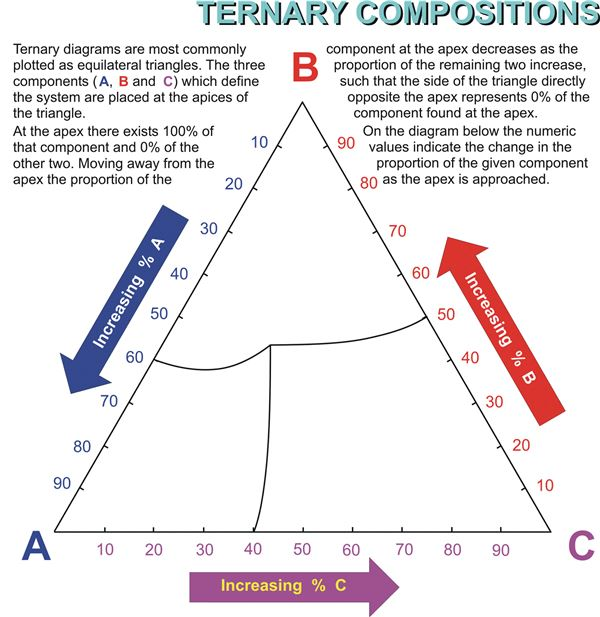
At each tip of the triangle you see a label, it means there is 100% of that component.

Now that you've mentioned it, it could certainly have used better labeling/colouring to make it easier to understand, as shown in the example below:
[-] davetortoise@reddthat.com 16 points 2 days ago

I can't decide if I love or hate this graph

[-] msfroh@lemmy.ca 7 points 1 day ago

I'm just trying to find sandy loam.

[-] davetortoise@reddthat.com 5 points 1 day ago

Ain't we all

[-] ArachnidMania@lemmy.ca 5 points 1 day ago

If biofuels was on the bottom, I feel like it would be more intuitive.

[-] scrubbles@poptalk.scrubbles.tech 15 points 2 days ago

It seems obvious to me. Why would you want to tie your economy to such a volatile dependency?

[-] MyVeryRealName@lemmy.world 4 points 1 day ago

Not just economy. Electricity is essential for food production, water motors, etc.

[-] dumnezero@piefed.social 1 points 2 days ago

There are a lot of theories of "DeVELoPMeNt!"

[-] rako@tarte.nuage-libre.fr 3 points 2 days ago

I love this graph though

[-] Deebster@infosec.pub 5 points 2 days ago

Countless hours into X-Wing vs TIE Fighter have taught me instant understanding of this graph.

this post was submitted on 21 Aug 2026
131 points (100.0% liked)

Green Energy

4549 readers
70 users here now

Everything about energy production and storage.

Related communities:

founded 4 years ago
MODERATORS