1
submitted 1 year ago* (last edited 1 year ago) by F4celess@sopuli.xyz to c/simracing@lemmy.ml

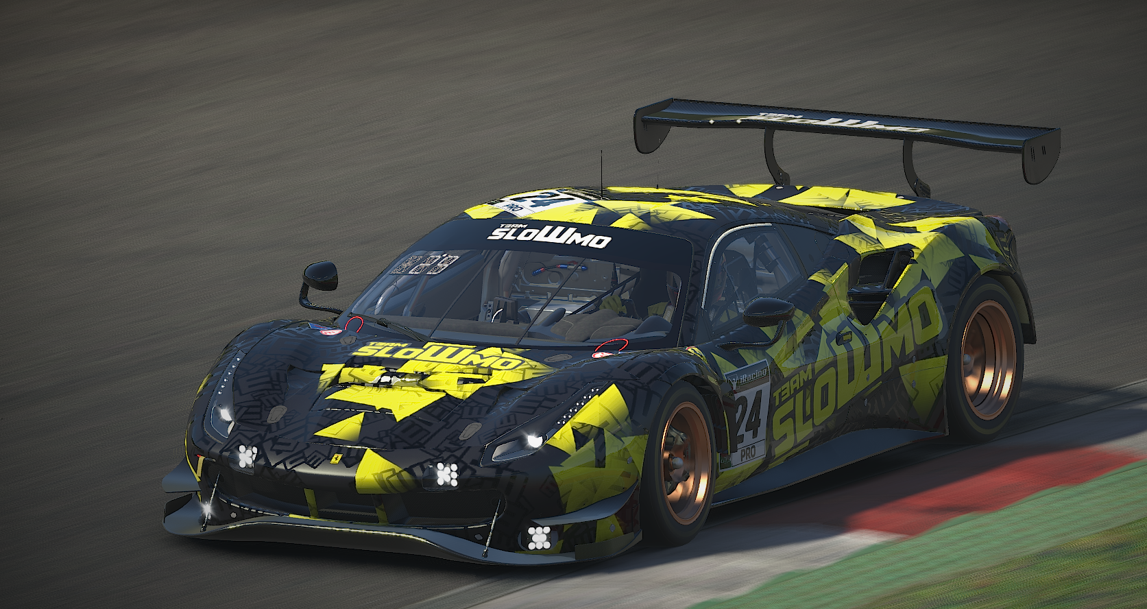
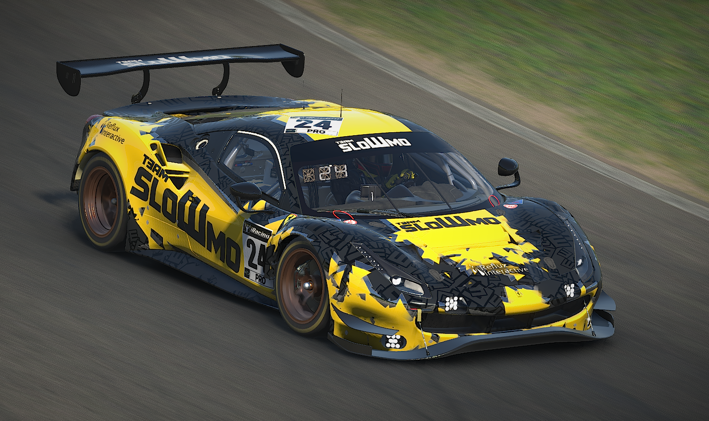
We have been running a triangle-based look for a while, and we're getting a bit tired of it, so the new look is going with more big blocks of color with triangular shapes still in the style but now more lumpy.

Our old look for comparison.

I'm open for commissions if anyone are looking to give their team a style. I can work with AC paints as well.

no comments (yet)
sorted by: hot top controversial new old
there doesn't seem to be anything here
this post was submitted on 09 Aug 2023
1 points (100.0% liked)

Sim Racing

889 readers
1 users here now

Discussing all things Sim Racing

founded 1 year ago
MODERATORS