25
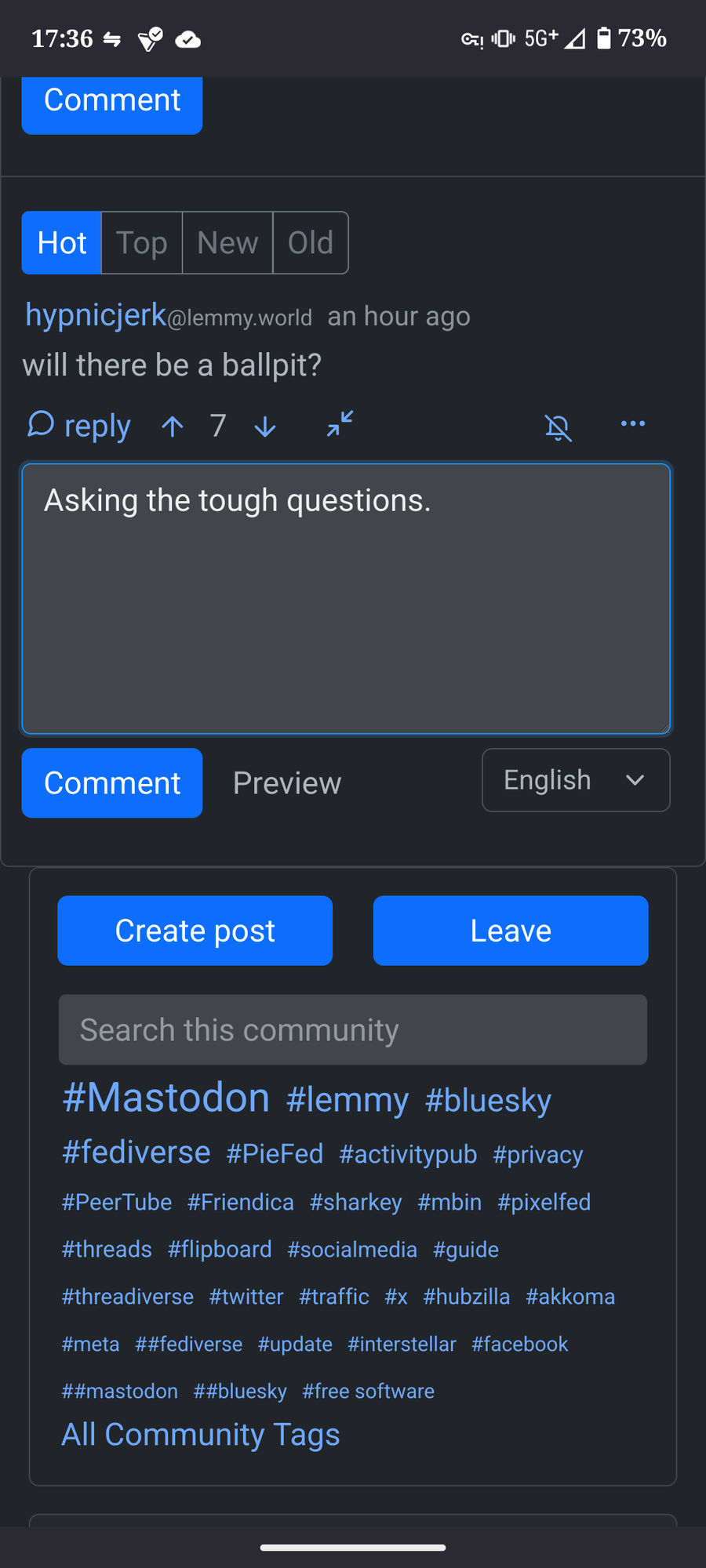
Mobile Browser - Leave button placement
(media.piefed.social)
On the mobile page. I'm right handed and meant to comment, but the Leave button was blie and right under tge box I was typing and was blue and I didn't even read the Leave and you guessed it, I left.
Suggestion would be to make the Leave button a different color like red? Or move? Idk. :-). Just a thought could just be I'm a silly.