677
submitted 2 years ago* (last edited 2 years ago) by aeharding@lemmy.world to c/voyagerapp@lemmy.world

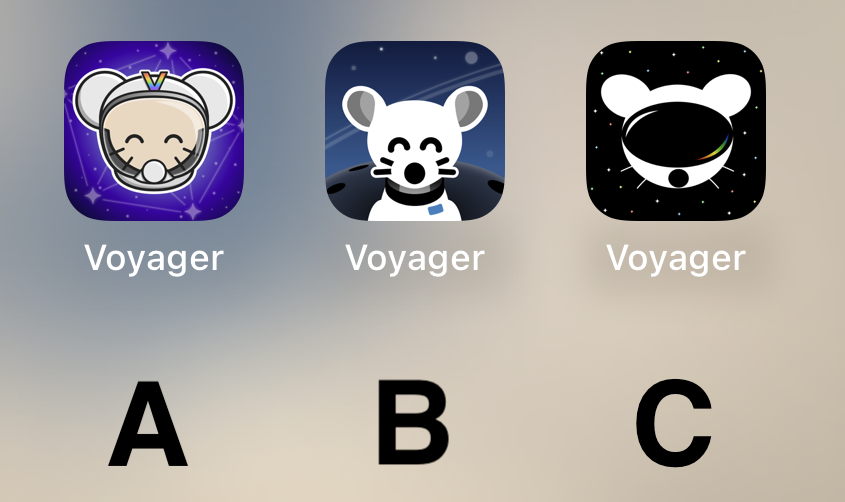
Voting has ended! Congrats to @fer0n@lemm.ee with option B. Thanks everyone for participating! :)


First off, thanks to everyone that participated in our icon contest last week!

I'm excited to show the final three options for you to vote on below!

Overview

Option A

Option B

Option C

๐Ÿ—ณ๏ธ Vote!

โš ๏ธ BEFORE VOTING I encourage you to tap through the links above to see what it's like on your homescreen!

Results of the poll will not be available until it has ended, so no need to make a rushed decision.

~~VOTE HERE: https://strawpoll.com/BDyNEbKeqZR~~

Strawpoll privacy

~~Polling ends in ~24 hours! If there is a tie, I will cast the final vote.~~

(page 4) 50 comments
sorted by: hot top controversial new old
[-] Octagon9561@lemmy.ml 7 points 2 years ago

B. A is also good. Don't like C at all.

[-] IanAtCambio@lemm.ee 7 points 2 years ago
[-] Flyspeck@lemmy.world 7 points 2 years ago

C is very sleek!

[-] beccaboben@lemmy.world 7 points 2 years ago
[-] h14h@midwest.social 6 points 2 years ago

I like A a lot, reminds me of the early iPhone days of tasteful skeumorphism.

B is probably my favorite tho -- definitely the cleanest.

C looks off to me, something about the goggles.

[-] illah@lemmy.world 6 points 2 years ago
[-] MightyWeaksauce@lemmy.world 6 points 2 years ago

I'd go with A! I like the presentation of B better but the little guy reminds me of Chuck E. Cheese or fnaf. Character in A is adorable :)

I liked C too but it kinda looks like the Reddit guy in VR goggles.

[-] Arthur_Leywin@lemmy.world 6 points 2 years ago

C Simple and cool but gets the point across.

[-] Snapz@lemmy.world 6 points 2 years ago

B, but the planet in the background makes it look like extremely large shoulders.

[-] MarioSpeedWagon@lemm.ee 6 points 2 years ago
[-] bigfish@reddthat.com 6 points 2 years ago

A looks like something an elementary school aged kid would have on their iPad for help learning to add.

B's got my vote.

[-] Jujuki@lemmy.world 6 points 2 years ago

I Vote for A. It pops out a bit. But then again it's my most used app. But B Also works. C is a bit unpolished IMHO.

[-] SharpMaxwell@lemmy.world 6 points 2 years ago* (last edited 2 years ago)

B, good middle ground of clean design yet still has personality

[-] Cheese@sh.itjust.works 6 points 2 years ago

A and B has too many details for an app icon that isnโ€™t for a game.

[-] ohlaph@lemmy.world 6 points 2 years ago
[-] Gork@lemmy.ml 6 points 2 years ago

๐Ÿ…ฑ๏ธ

[-] sethal@lemmy.world 6 points 2 years ago

I like B the best.

[-] PuddingFeeling907@lemmy.world 6 points 2 years ago

I will be happy with either b or c

[-] Zeram@lemmy.world 6 points 2 years ago
[-] FuckSpez@lemmy.one 6 points 2 years ago

Definitely B

[-] Kuunha@lemmy.eco.br 6 points 2 years ago
load more comments (1 replies)
[-] ozymandias@lemmy.world 6 points 2 years ago

B looks best for me

[-] lazycouchpotato@lemmy.world 6 points 2 years ago

Why I chose "B": It's clean and professional-looking. "A" looks a bit complex in comparison, and "C" doesn't look much like a lemming.

[-] weLookAbove@lemm.ee 6 points 2 years ago

B with the helmet of A (minus the โ€œVโ€)

[-] llIStormIll@feddit.de 6 points 2 years ago
[-] TheFrirish@jlai.lu 5 points 2 years ago

I wanna see C it's the cooles imo.

[-] Macallan@lemmy.world 5 points 2 years ago
[-] Targox@lemmy.world 5 points 2 years ago
load more comments (2 replies)
[-] Achsonaja@sh.itjust.works 5 points 2 years ago

Can we have them all and a setting to choose? Other apps do that. Is it a limitation of the PWA?

[-] aeharding@lemmy.world 7 points 2 years ago

It is a limitation of a PWA. A native app (wrapper) will likely be coming though, and a custom Capacitor plugin could theoretically interface with the native API to switch out icons.

Theoretically. No promises though :)

load more comments (1 replies)
[-] A10@kerala.party 5 points 2 years ago
[-] Shit@sh.itjust.works 5 points 2 years ago
[-] ThisIsNecessary@lemmy.world 5 points 2 years ago

All the other Lemmy apps I tested have themed icons. Be nice to have the same with the only Lemmy app I use ๐Ÿ˜

[-] Llamajockey@lemmy.world 5 points 2 years ago

C runner up A

[-] fer0n@lemm.ee 5 points 2 years ago* (last edited 2 years ago)

I really like A, feels very professional

[-] Poiar@sh.itjust.works 5 points 2 years ago
[-] PaperVinyl@lemm.ee 5 points 2 years ago

C is amazing.

[-] Esjee@lemmy.world 5 points 2 years ago* (last edited 2 years ago)

B but with the helmet and head of A would have been amazing. A looks to shiny rn.

[-] Taeye0n@lemmy.world 5 points 2 years ago

I really like B!

[-] tomkatt@lemmy.world 5 points 2 years ago
[-] botorfj@lemmy.world 5 points 2 years ago

obviously B

[-] Epicurus0319@lemmy.world 5 points 2 years ago

I vote for A

[-] MartianFox@feddit.de 5 points 2 years ago

I like Option B the most

[-] odama626@lemmy.world 5 points 2 years ago
load more comments
view more: โ€น prev next โ€บ
this post was submitted on 18 Jul 2023
677 points (100.0% liked)

Voyager

7622 readers
30 users here now

The official lemmy community for Voyager, an open source, mobile-first client for lemmy.

Download on App Store

Download on Play Store

Use as a Web App

Download on F-Droid

Rules

  1. Be nice.
  2. lemmy.world instance policy

Sponsor development! ๐Ÿ‘‡

Number of sponsors badge

๐Ÿ’™

founded 2 years ago
MODERATORS