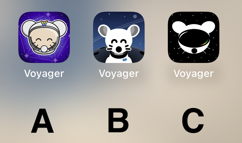
B is my first choice. Most similar to what I used for Apollo. Second choice would be c.
Option C please!!!!
I like the background of B the best. But it looks more like a dog and it's throwing me off. I like the character of the first one better, especially with the V on the helmet.
So I think I'm voting for A
Really like A! Good job to all participants though!
C
C mouse with A background please
C
C for sure
It’s really cool to have such talent in this community to go along with such an amazing app. The 3 finalists are really good. I don’t usually use dark icons but I love C so much. I hope to see variations of it as the app grows. Congratulations to all who made it to the top 3! That in itself is an accomplishment. I can’t wait to see the results of the final! This community is awesome!
B
I don't like any of them. That said, I voted for C. It's kinda plain, but that's what I like about it. The other ones are too messy.
B
B
B
B.
I like B the best
Definitely B
B!! :D
B
B
Current icon
C
B
C
B my lord
I prefer what we already have but if we have to change then go with A
i vote for B cuz i think it's the cutest 🐭
B Please! Looks so very clean.
C looks like Daft Punk mouse
B
B by far
All are very good, but B takes the cake for me personally.
Definitely A.
B is kinda creepy and C looks like a VR app.
I can't decide between A and C... I am gonna go for C I guess.
BTW can we have different icons like Apollo had?
Loving the C image design, it looks great
I liked C best at first glance, but after looking at the screenshots my choice is A.
I’m just here to say: CHARGE YOUR PHONE!
Also, C A B is my ordered preference.
Definitely B
Voyager
The official lemmy community for Voyager, an open source, mobile-first client for lemmy.
Rules
- Be nice.
- lemmy.world instance policy
Sponsor development! 👇
💙


