896
Beautiful but worrying 🌍
(jlai.lu)
A place to share and discuss data visualizations. #dataviz
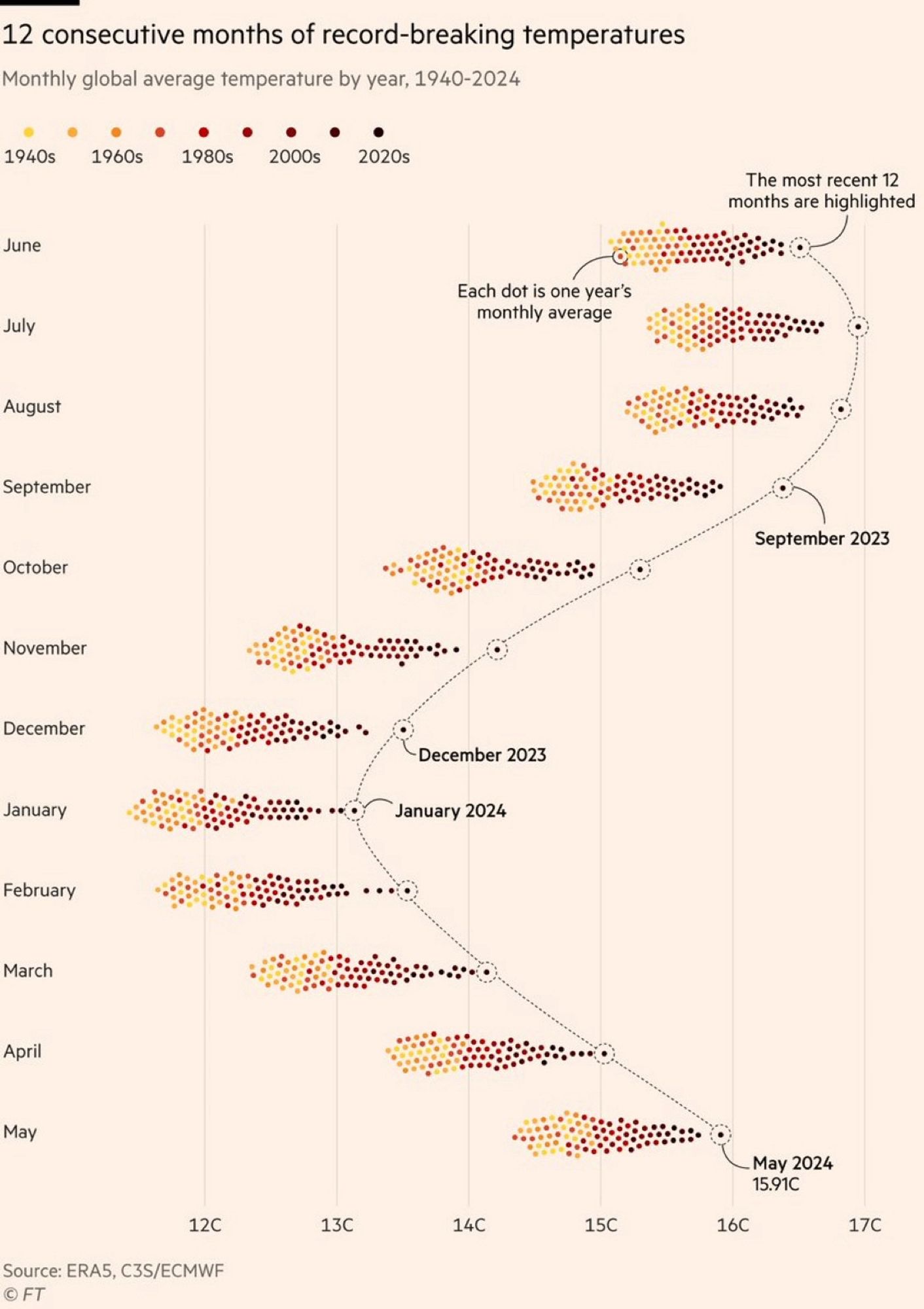
It took me a while to read that chart, meybe the heat I don't know.
But what I got is roughly 1.5°C increase in the last 80 years, is that correct? Would be nice to see this compared to the previous 80 years.