896
Beautiful but worrying 🌍
(jlai.lu)
A place to share and discuss data visualizations. #dataviz
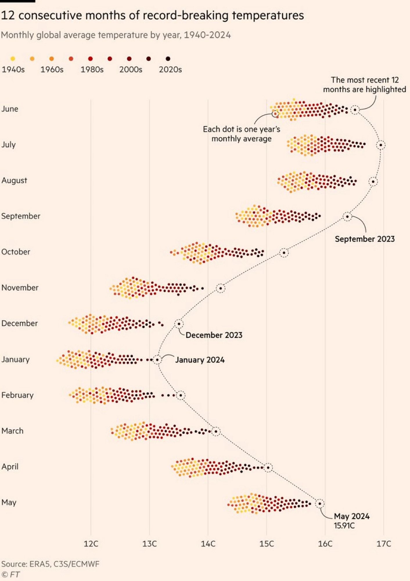
The color grading of the years is really bad. The last 20/30 years are all very low in contrast compared to each other, while 1940s and 60s are easy to tell apart, where it is least important. There are so many more colors than yellow/orange/brown, we can use them to get more information density.
Making data beautiful is what this community is about. But compromising readability for a color scheme is just annoying. Present data first, worry about it being extra pretty second.
We're already looking at time being encoded differently than the usual horizontal axis, don't make it harder.
On the other hand, if the purpose of the graph isn't to present individual data points, but to present the monthly trends, then maybe it would have been OK, if the last 3 decades could have started over with a higher luminance set of colors. IDK but I think I would have used colors with more contrast and dropped the warm earthy theme.
Glad there's someone here who cares about what's really important about this graph! /s