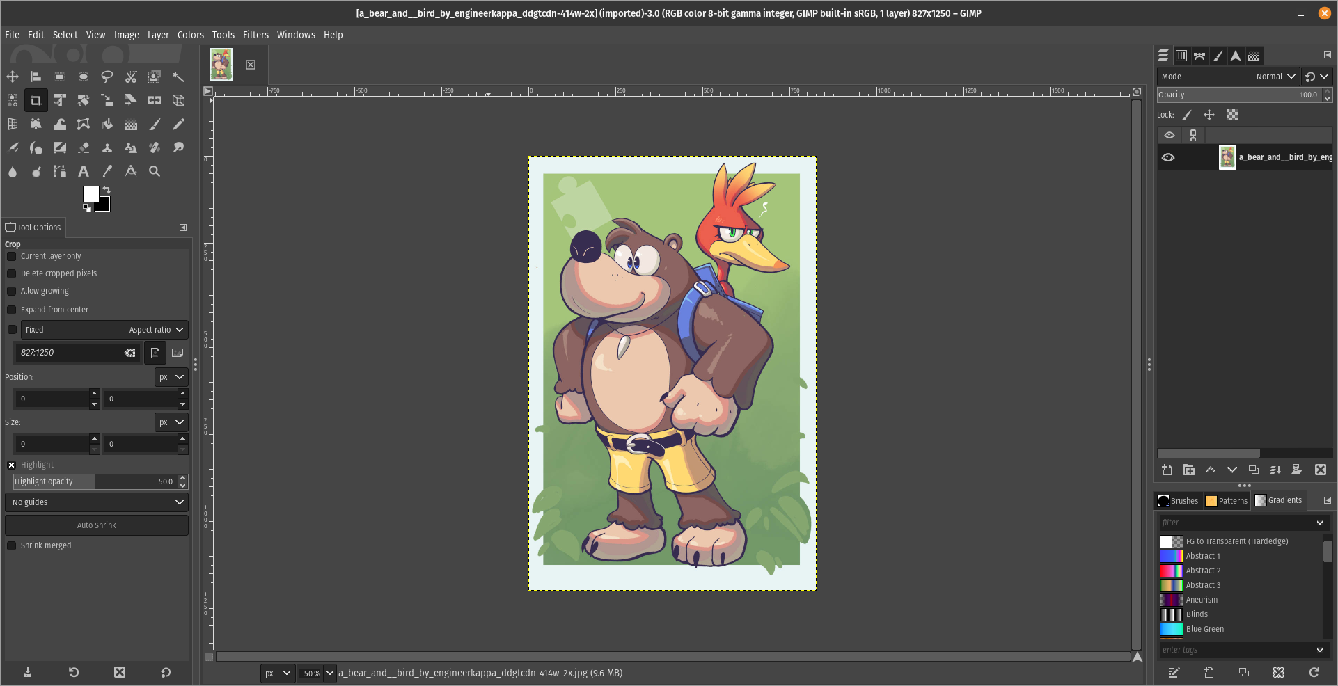
For what i heard, a lot of people on the Linux community use Krita for image manipulation, even though, it's intended for digital painting, and GIMP is the one intended for image manipulation, because people don't like the GIMP's UI.
My issue is, i never understood why they don't like the GIMP's UI, since i never have issues with it,(Although it's probably because i'm used to the UI) so i need to adress this problem and ask you What does the GIMP UI has that you don't like or hate so much and why you like Krita's UI over GIMP's?
Before you event comment your answer i need to ask you to do the following:
-
Address each specific issue along with an concise and direct explanation of why you don't like it
-
Answers such as "I just don't like it", "I don't like where it's placed" or anything alike doesn't count as "Concise and Direct", we are adults, not 4 year old children.
-
If you can provide a suggestion of how GIMP's UI can be improved, it would help a lot, and maybe this issue can be solved.
-
If someone else commented something you were about to comment, upvote them, this way we can address the most common issues effectively.
-
I need you to watch the screenshots of both UI's, because something that most people don't know, it's how similar Krita and GIMP's UIs are.
Krita's UI

GIMP's UI

(Credits to a friend of mine for lettig me use the screenshots.)
My ideas on how GIMP can improve it's UI
-
Adding the option of the new UI selected by default, but with the possibility to switch to the new UI.
-
Possibly addding "work spaces" like Krita would help too, along with the possibility of exporting and importing them, this way people can have custom arrangements of the UI according to the kind of work they will do.
Thanks for reading and hopefully we can address this issue effectively.
As others have mentioned, it's simple things takes alot time finding/figuring out.
I use GIMP within Ubuntu MATE few times a week to edit pictures. Simple edits nothing major.
One of the thing I need regularly is to highlight certain part of the picture.
Now in Microsoft Paint I can draw a rectangle, choose its border thickness, and color in 2 seconds.
I have learned how to do the same in GIMP few times but it took alot of time and I still forgets after few weeks.
So now I just reboot the PC and log into Windows or use Windows virtual machine and draw rectangle in 2 seconds in Microsoft Paint.
Mine is extremely simple use case, so I can only guess how difficult or how time consuming it would be for actual professional to create artistic work in GIMP vs Photoshop (or in similar commercial software).
Just my 2 cents.
I hope you're joking about rebooting to Windows for paint 😁
But just in case, and for the benefit of others: KolourPaint
It's basically KDE Paint, and works great as a simple image editor
Yeah i agree, it's even available as Flatpak which makes it even better.