For what i heard, a lot of people on the Linux community use Krita for image manipulation, even though, it's intended for digital painting, and GIMP is the one intended for image manipulation, because people don't like the GIMP's UI.
My issue is, i never understood why they don't like the GIMP's UI, since i never have issues with it,(Although it's probably because i'm used to the UI) so i need to adress this problem and ask you What does the GIMP UI has that you don't like or hate so much and why you like Krita's UI over GIMP's?
Before you event comment your answer i need to ask you to do the following:
-
Address each specific issue along with an concise and direct explanation of why you don't like it
-
Answers such as "I just don't like it", "I don't like where it's placed" or anything alike doesn't count as "Concise and Direct", we are adults, not 4 year old children.
-
If you can provide a suggestion of how GIMP's UI can be improved, it would help a lot, and maybe this issue can be solved.
-
If someone else commented something you were about to comment, upvote them, this way we can address the most common issues effectively.
-
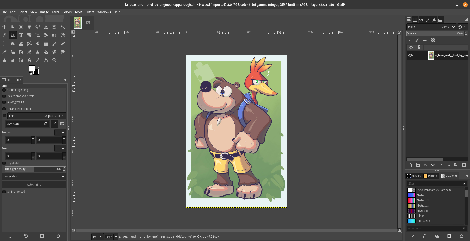
I need you to watch the screenshots of both UI's, because something that most people don't know, it's how similar Krita and GIMP's UIs are.
Krita's UI

GIMP's UI

(Credits to a friend of mine for lettig me use the screenshots.)
My ideas on how GIMP can improve it's UI
-
Adding the option of the new UI selected by default, but with the possibility to switch to the new UI.
-
Possibly addding "work spaces" like Krita would help too, along with the possibility of exporting and importing them, this way people can have custom arrangements of the UI according to the kind of work they will do.
Thanks for reading and hopefully we can address this issue effectively.
All I want is to GIMP to save tabs layout as workspaces. That is enough. Part of GIMP hate is based on 15 year old complaints. Just like people still complains today about stuff of Linux that has been resolved for decades. It's just memery that has stuck around.
There are issues with GIMP, but none are about the stuff most people meme about in social media. Every tool has room to grow, but GIMP UI suffers from the “too amateur to know what's wrong” loud majority effect. Imagine someone who has no concept of music appreciation in their lives sits at the front of a grand organ. Then proceeds to complain that the pedals get in the way of sitting on the stool and that he founds the three keyboards redundant and unintuitive. This notion is valid, from his point of view. But it informs nothing about the usability of that particular instrument for a professional organ player.
The same thing tends to happen with several software packages, specially the open source ones. Since they don't have the industry standard tag, they don't get any leniency when it comes to learning their features and capabilities. Then, when the amateur checks them out, they don't compare it to the industry standard (which does have a leniency license) but compare it to the simplified, accessible for everyone and strip down apps. These people don't have the foresight to understand that this tool is capable of way more than their reference point, and the initial friction is an indicator of their inexperience, not of the tool's quality or potential.
The amateur is more comfortable sitting in front of a Casio learner piano. And we shouldn't lend much credence to their feedback about the ergonomics or key feel of a Steinway concert grand.