1187
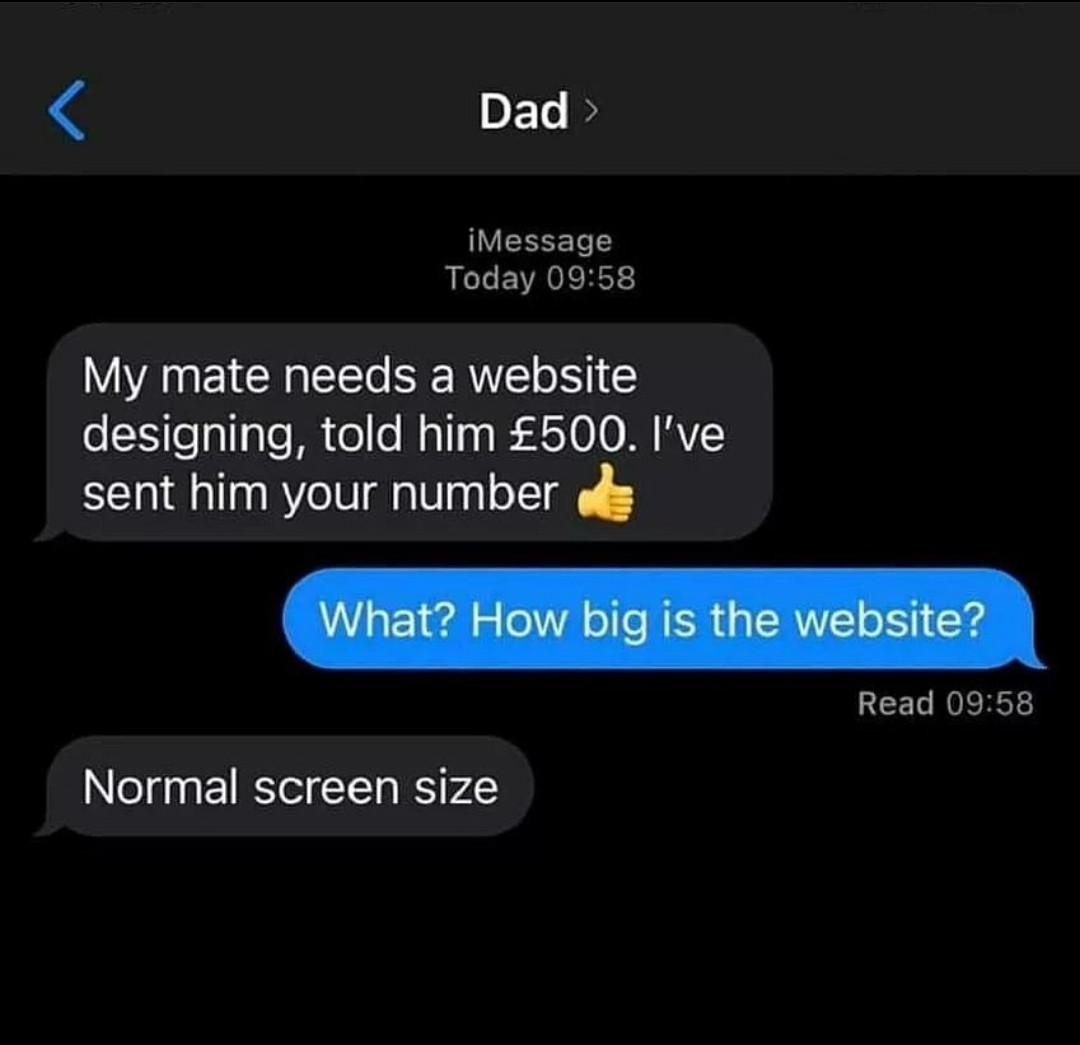
Dad has the chops to be a project manager.
(lemmy.world)
Welcome to Programmer Humor!
This is a place where you can post jokes, memes, humor, etc. related to programming!
For sharing awful code theres also Programming Horror.
My dad asked me if I could build a site for him. I tried, but ultimately didn't have the chops (I can customize Wordpress, but this was supposed to be from scratch and I didn't keep up when things like CSS came into being; old). I sent him to hire an outside party.
Here's the thing: he wanted his menus vertical on the left side. I told him that's not how it should be done; they should be at the top. But he was adamant. Later, he told me that his web consultant shop had also said the same. It's the only time he ever said, "you were right," about anything like in my entire life. Not that he was an asshole (though he really was when I was growing up). It's just not something he said. And no one can take that from me. I even called my mom and told her.
And now... Lots of websites with menus on the left!
Still, happy for you that your dad could humble himself to you. That's really hard for some people, even when they'd like to, it's like your brain just won't compute how to say it without coming out wrong so you never say it.
Your dad is right. On desktop, navigation is on the left. On tablet, you shrink it to a rail. On mobile it should be a dismissible nav drawer.
The top menus, especially the flyover(on mouse hover), are bad for accessibility because they convert a non-committal action (hover) to a context changing one (focus). It's a uniquely web-only invention and thankfully falling out of usage. (Unless you mean menubar/toolbar. Those are fine but extremely rare on Web.)
I don't get it.
We have only 1080px in vertical, part of which is also used for Taskbars, titlebars and toolbars in most cases. Then there is this trend of sites not using most of the horizontal space for main body text.
So, what reason do we have to not use the wasted side-space and instead congest the already low vertical space?
I would understand if it were a mobile-only site or if you were explicitly talking about the vertical version of it, but even for 4:3, I won't consider a sidebar to be a bad idea, unless perhaps, it was German.