117
you are viewing a single comment's thread
view the rest of the comments
view the rest of the comments
this post was submitted on 05 Aug 2023
117 points (100.0% liked)
Canvas
2379 readers
2 users here now
Canvas — A collaborative annual pixel placing event for the Fediverse!
2025 Concluded!
Links
- fediverse.events
- GitLab / Source
- Matrix Space
- Discord Server (bridged to matrix)
Timelapses
founded 2 years ago
MODERATORS


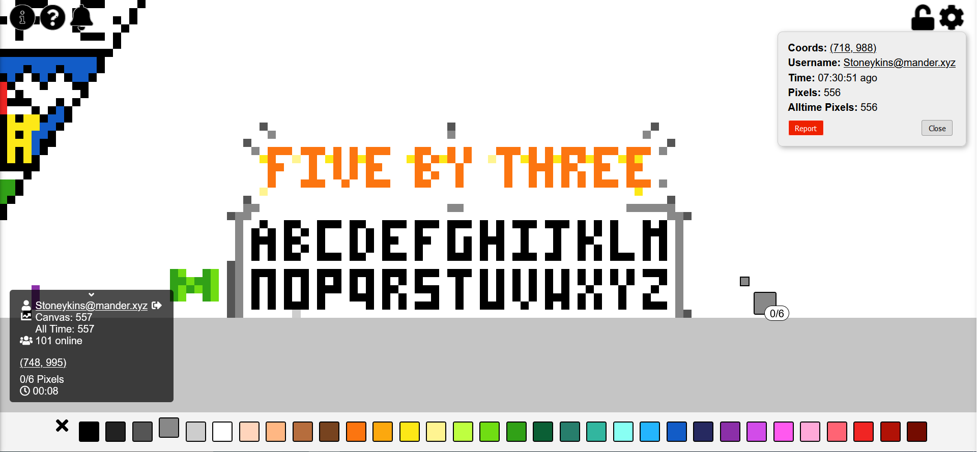
The J above the OR seems better
people do seem to prefer that one. I'll probably change it after I get the color stuff done, to give more time for people to weigh in.